Automotive Design for the Cars Universe
Words by Brian Griebenow
Photos provided by Disney / Pixar Studios
I have a passion for design, or rather…Design. During my years as a designer of industrial manufacturing machinery, I sought simple solutions and efficient execution. One of my cherished gifts from my wife is a beautiful coffee table book about legendary industrial designer Brooks Stevens. I also have a mental list of my favorite car designs. What lifelong automobile enthusiast doesn’t?
As a Contributing Editor for Auto Exotica Magazine, my usual responsibilities include driving (the snot out of) a high performance car for a day or two, and then writing about it. While that’s not a bad gig, I was recently given an assignment that made my design sensibilities go all tingly. I was afforded the opportunity to interview the folks responsible for designing some of my all-time favorite cars, or rather…Cars.
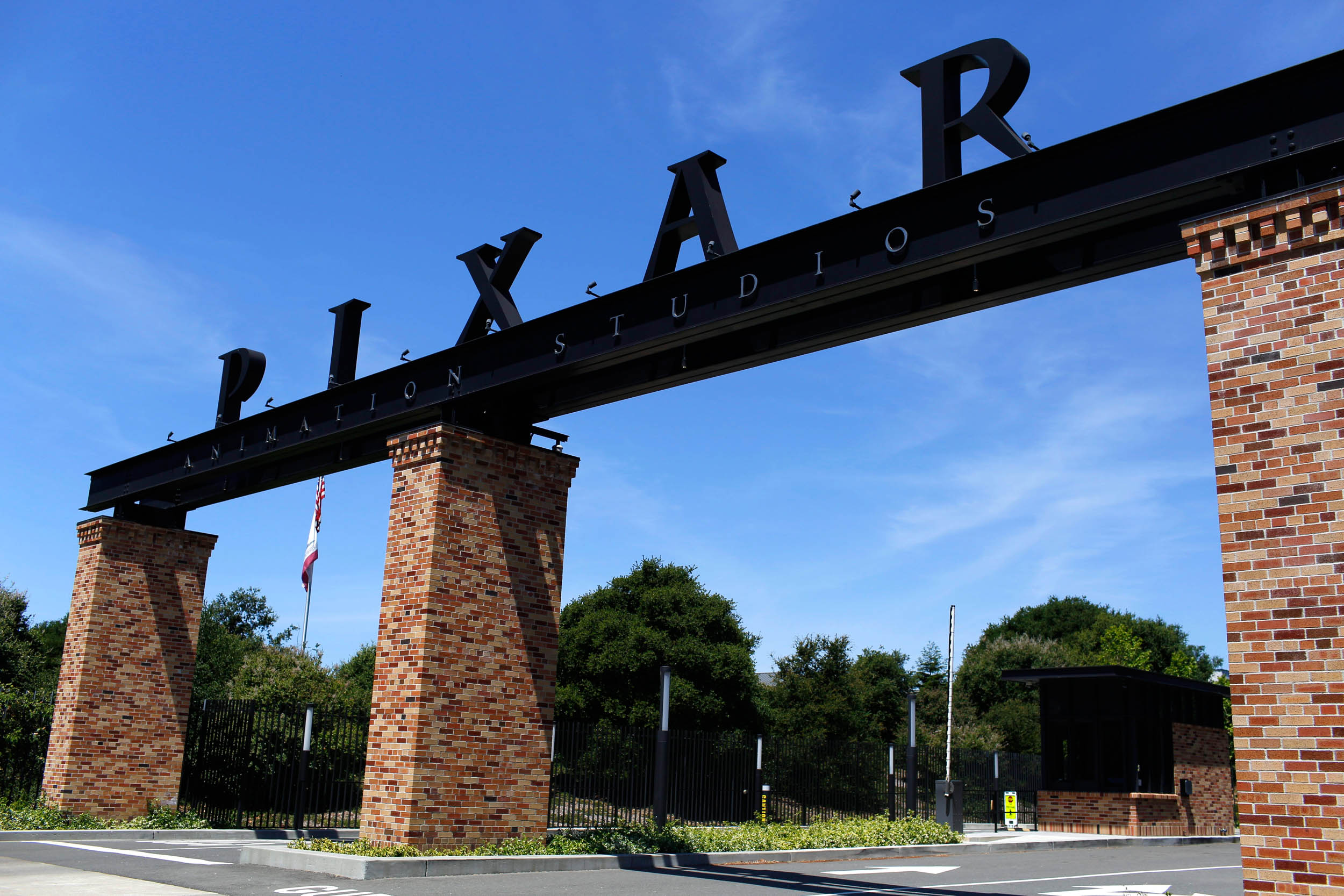
Who, you ask? Gordon Buehrig (Cord 810)? Malcolm Sayer (Jaguar E-Type)? Maybe Moray Callum (2017 Ford GT)? No. Two of them have expired and the other is far too busy. No, this dream job would land me in the studio responsible for such legends as Lightning McQueen, Doc Hudson, Tow Mater, and cutting edge new arrivals like Jackson Storm and Cruz Ramirez. That’s right, Pixar Animation Studio in Emeryville, California.
Right up front, please allow me a moment to give a shout-out to the following magic makers who welcomed me briefly into their world, opened my eyes, taught me just a little, and were genuinely generous, friendly folks: Brian Fee (Director Cars 3), Andrea Warren (Co-Producer Cars 3), Jay Ward (Creative Director), Jay Shuster (Production Designer), Michael Comet (Characters Supervisor), Jude Brownbill (Directing Animator), Bill Cone (Production Designer), Han Cho (Sets Supervisor), Dave Mullins (Director, LOU), Dana Murray (Producer, LOU), and Janna Bettencourt (Publicist, Walt Disney Co.).
So, what is automobile design? Is it drawing a pretty shape that can be formed out of sheet metal or carbon fiber? Is it inventing new ways to stick a car through the turns? Perhaps it is coming up with new ways to draw drivers into a show room? Let’s ask a few non-random people…
“Design is not just what it looks like and feels like. Design is how it works.” – Steve Jobs
“If you can dream it, you can do it.”
– Walt Disney
“I couldn’t find the sports car of my dreams, so I designed it myself.”
– F. A. Porsche
“All of those cars were once just a dream in somebody’s head.”
– Peter Gabriel
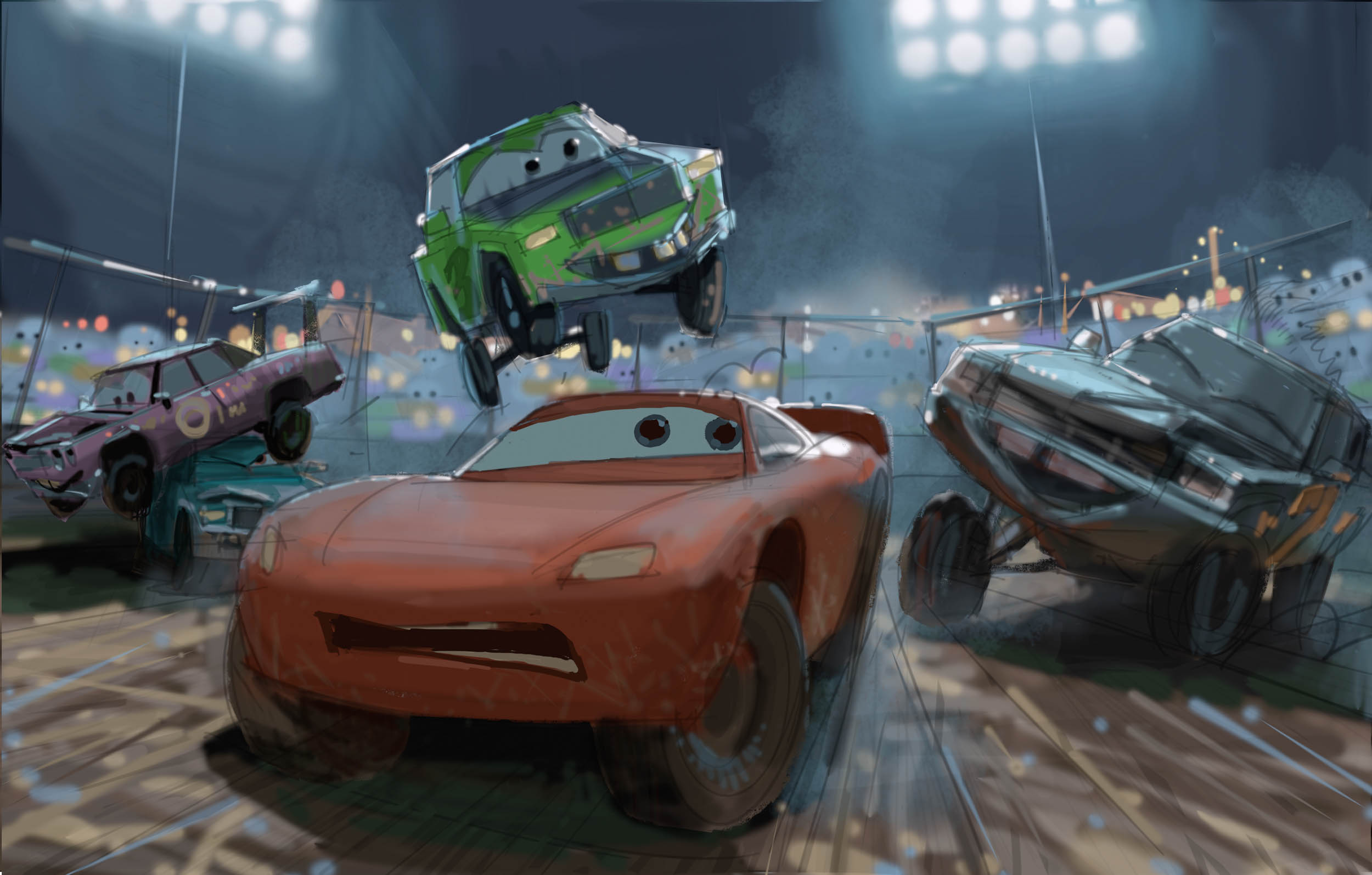
We all understand that manufacturers from Porsche to Cadillac to Kia employ teams of people to design cars for our world. But what about the cars of the “Cars” world? How does the process differ when designing cars for a world that’s imaginary vs. real? I can assure you that the designers are real, and friendly, and they do not begin with an imaginary pencil. But even at a studio chock full of leading edge graphic animation technology, the dear pencil still plays a role.
Automobile designers for both worlds agonize over line, angle, proportion, and attitude. This is true for not only the body shape, but trim details as well. Think wheels, lights, and exhaust tips. Those basics are shared, but each world places unique challenges on its designers.
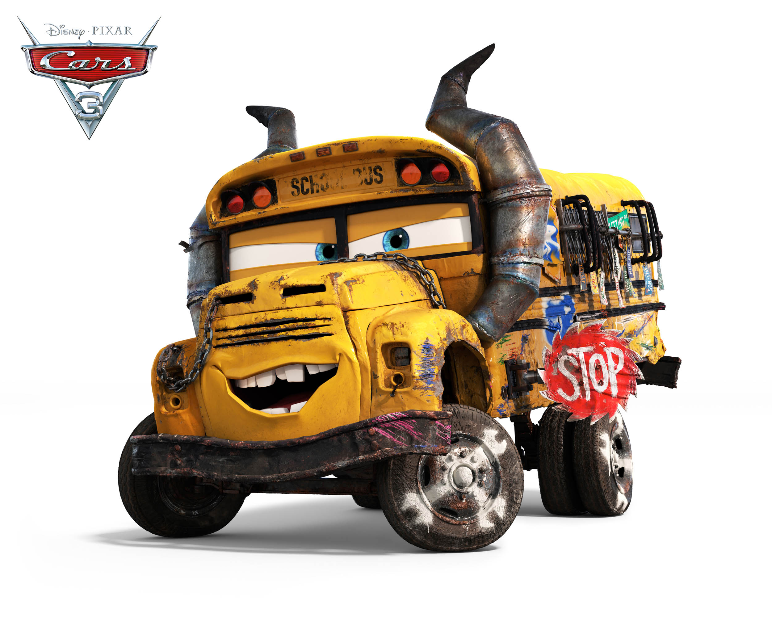
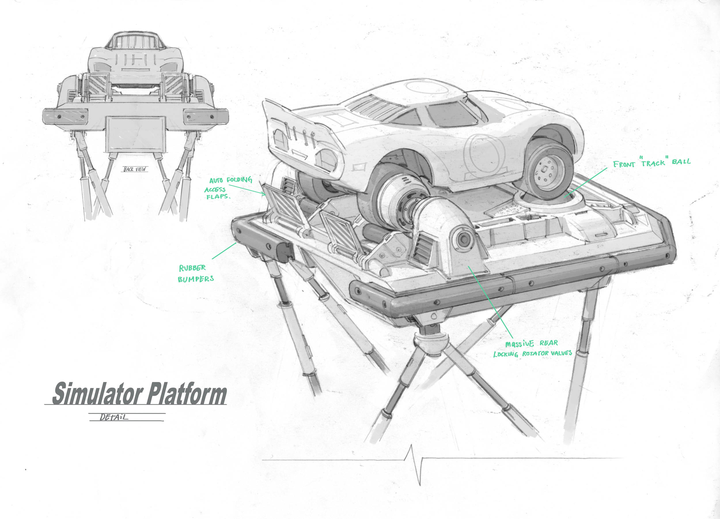
For example, designers of real-world cars have to tackle interior design while designers of imaginary “Cars” need not go there. But where designers at Audi or Jaguar limit their focus to new designs, the folks at Pixar must design not only new models but historic and vintage cars as well. Think about that. They don’t have the luxury of relying on previous designers to design cars of the past. When the world of “Cars 3” needed old vehicles, the designers at Pixar created those designs. Not only the shape of the old car, but every bit of patina as well; the paint fade, the rust, the broken trim pieces, even the clatter of a tired engine.
For any “Cars” film, a Character Design team follows a comprehensive process in designing the vehicles that will populate that magical “Cars” world. For “Cars 3” Jay Shuster, Michael Comet, and Jude Brownbill played key roles on the Character Design team. They were kind (and patient) enough to walk me through the basic steps of that process.
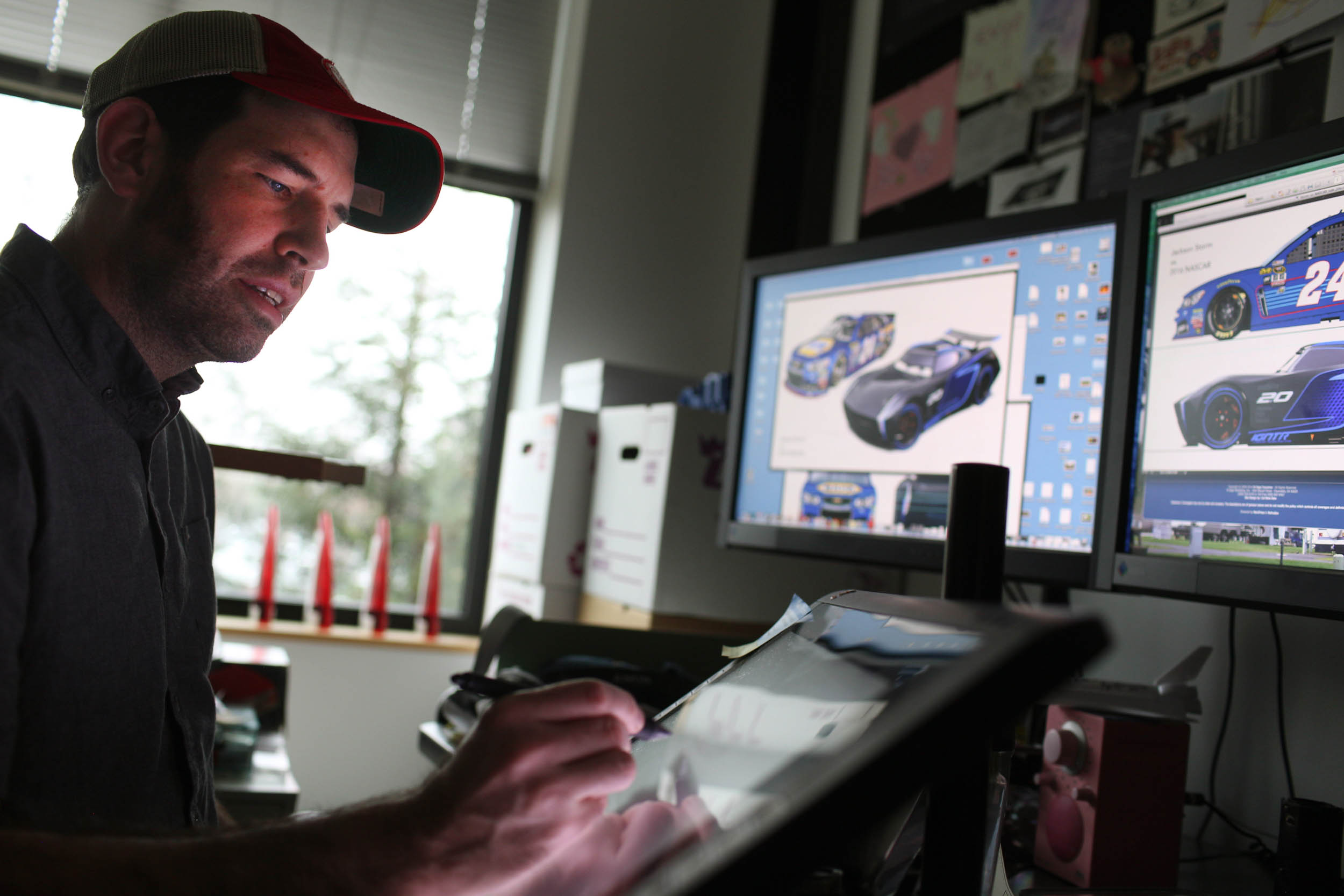
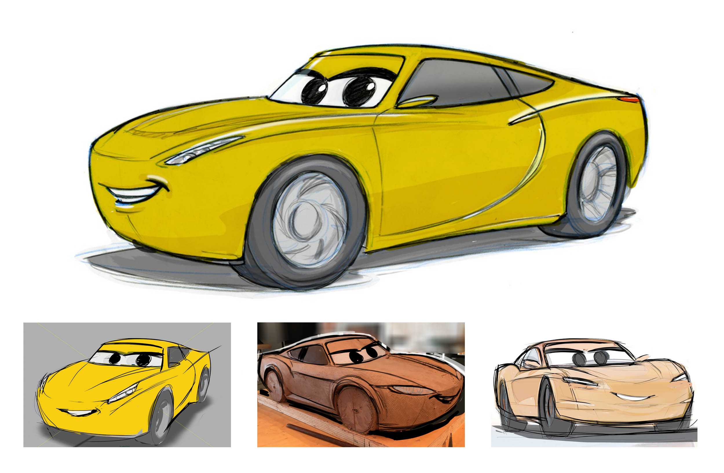
One question I needed to ask was, “how do you go about adding a personality, a character if you will, to a car?” I quickly learned that my concept was reversed. It turns out that before a single line is drawn, the character—personality and all—already exists. Character first, vehicle second…always. To get that first line drawn, the designer interacts with the story group to understand who each character is. Their background, traits, personality, and behaviors all play a role in defining the car. Then it’s an iterative process of creating and refining sketches while keeping abreast of the developing story.
I was curious as to why some “Cars” characters are dead-on ringers of cars from our world, while others are custom designs unique to the “Cars” universe. It turns out that there are no rules around that. For the first film, if the team felt a real world make/model perfectly fit a character, they would go with it. Could Luigi be anything but a Fiat 500? When characters are based on historic figures, like Strip “The King” Weathers, the choice can be obvious…and epic. There have been a few rare instances when the team asked a character what model they should be based on. That was the case over a decade ago when Mario Andretti chose to be a 1967 Ford Fairlane, the car he drove to victory at Daytona. But, for central characters like Lightning McQueen, there is a real desire to take ownership and enjoy the creative freedom of designing from scratch.
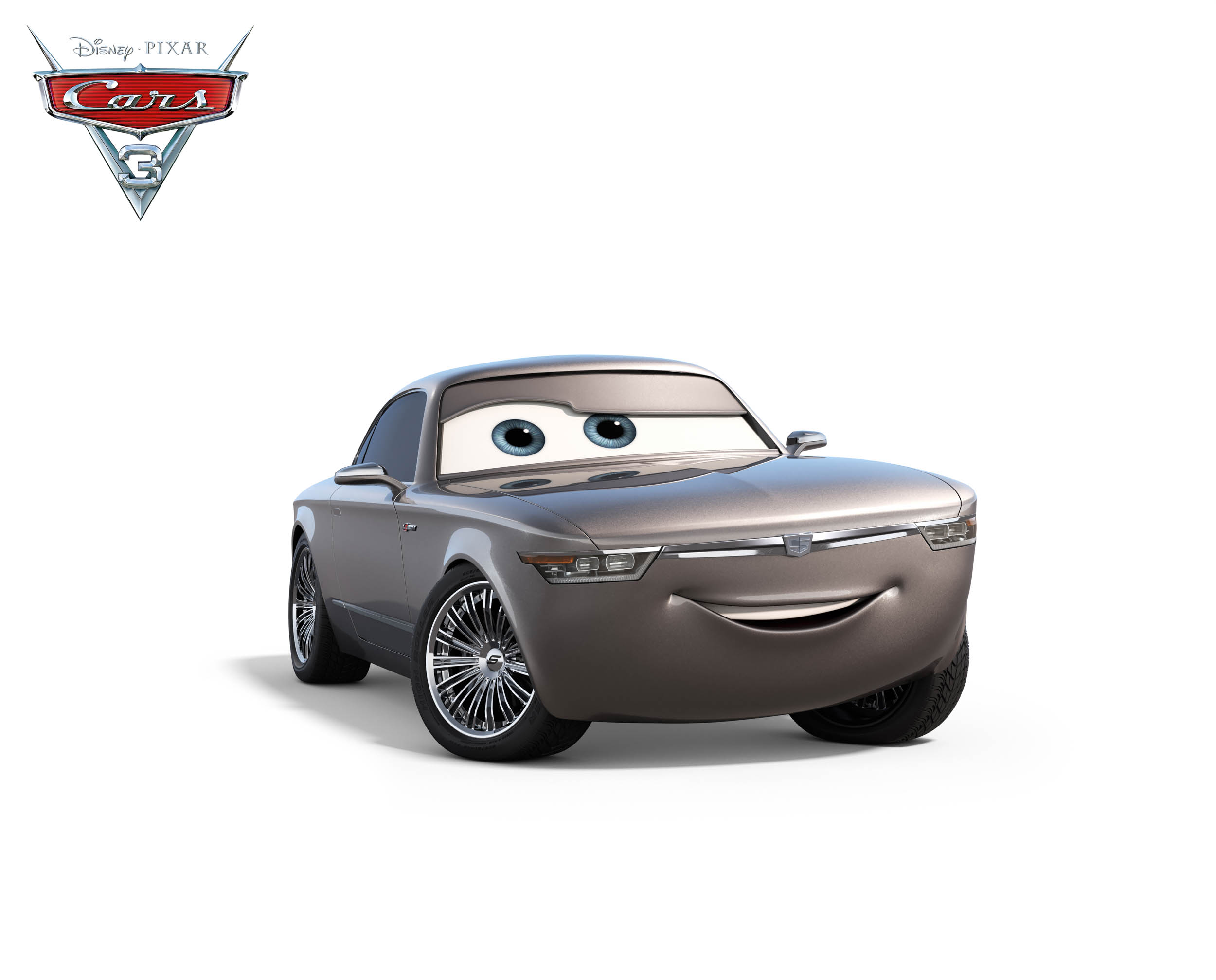
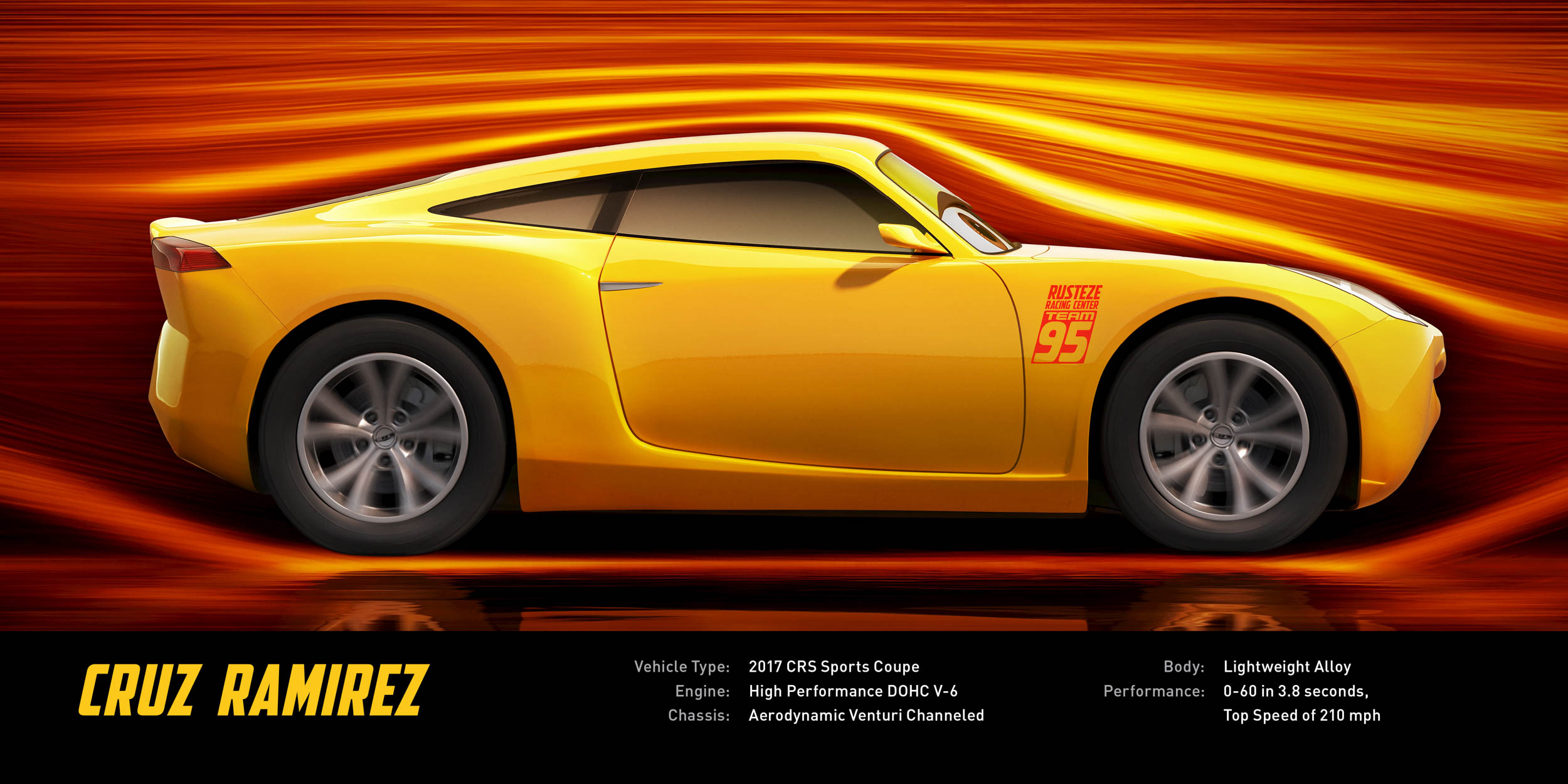
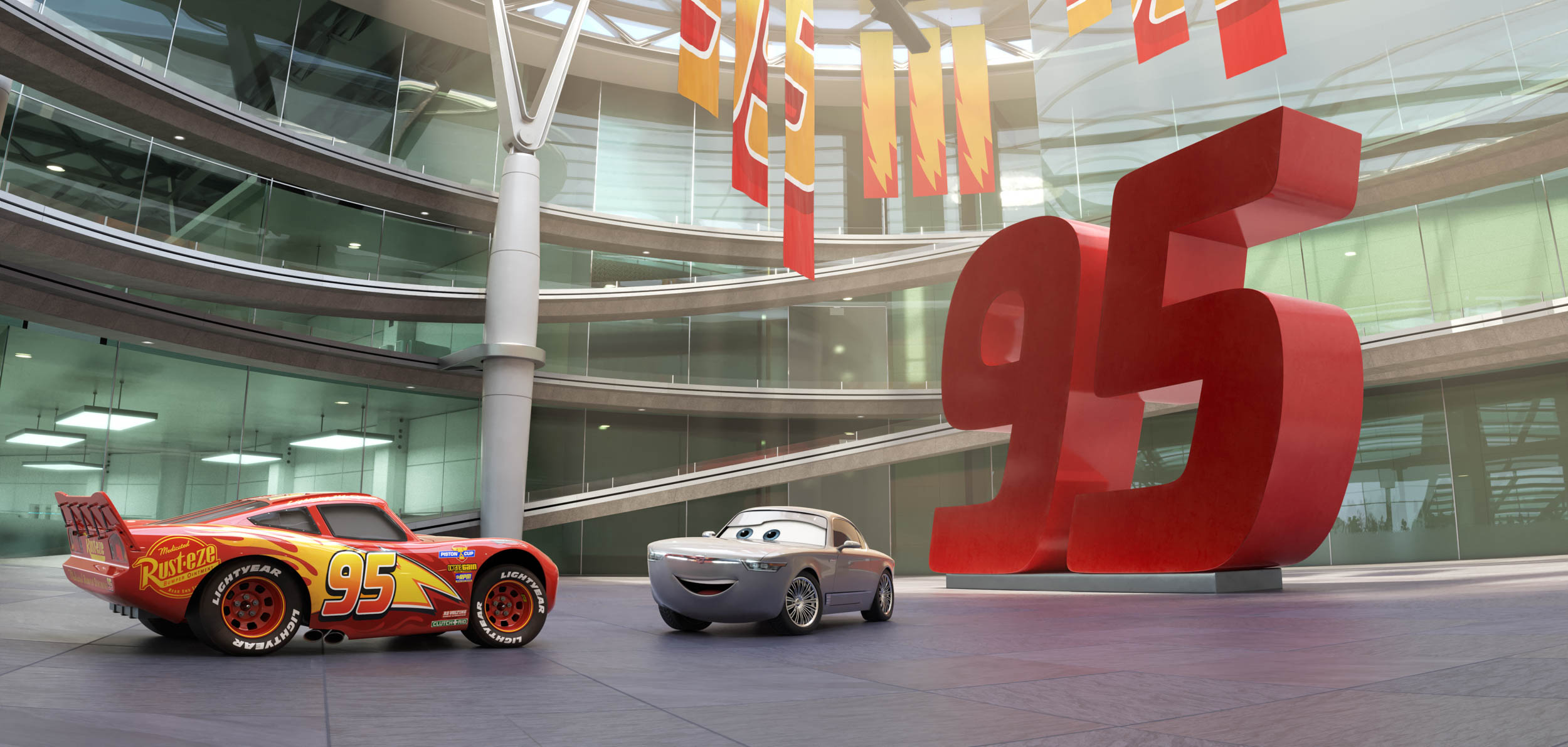
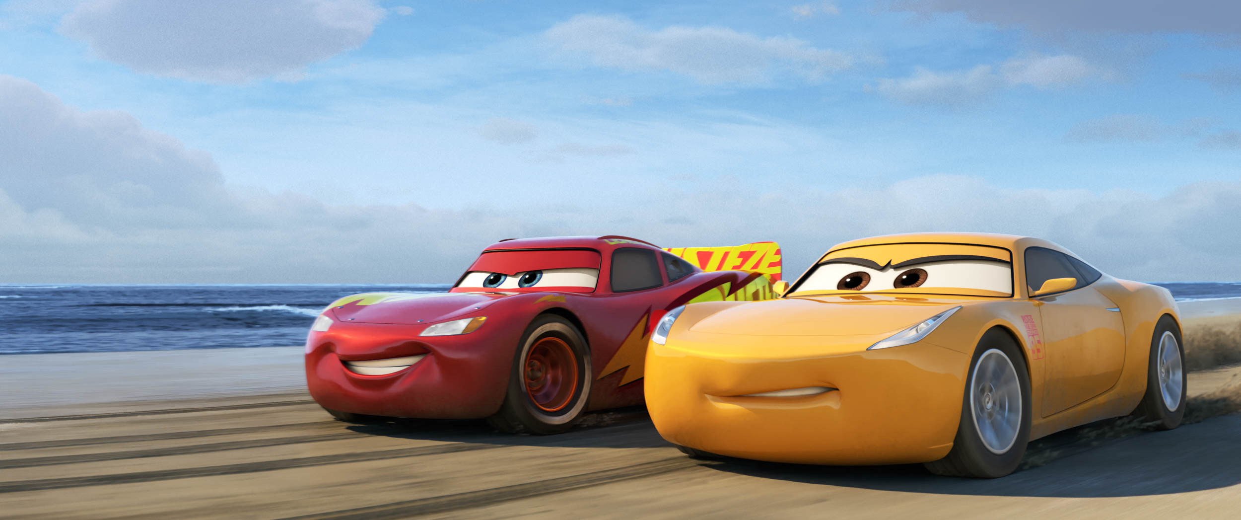
Whether creating a new design from scratch or designing a “Carification” of a real world model, the steps of the process are much the same, with stunning results. Personally, I have a soft spot for Flo’s mid-century show car vibe. Brian Fee, Director of “Cars 3”, confided that his personal favorite is Sterling…cool, confident, with an older style that’s aged well. For Andrea Warren, Co-Producer of “Cars 3”, it’s Cruz Ramirez…strong, elegant, feminine and powerful. When I told the design team that they are designing some sweet looking new cars they chuckled but also acknowledged that there is a lot of pride and sweat in designs like Jackson Storm and Cruz Ramirez. John Lasseter, Pixar’s Chief Creative Officer (i.e. boss), has gone so far as to say he wants car people to watch these films and say, “Where can I buy that car?”
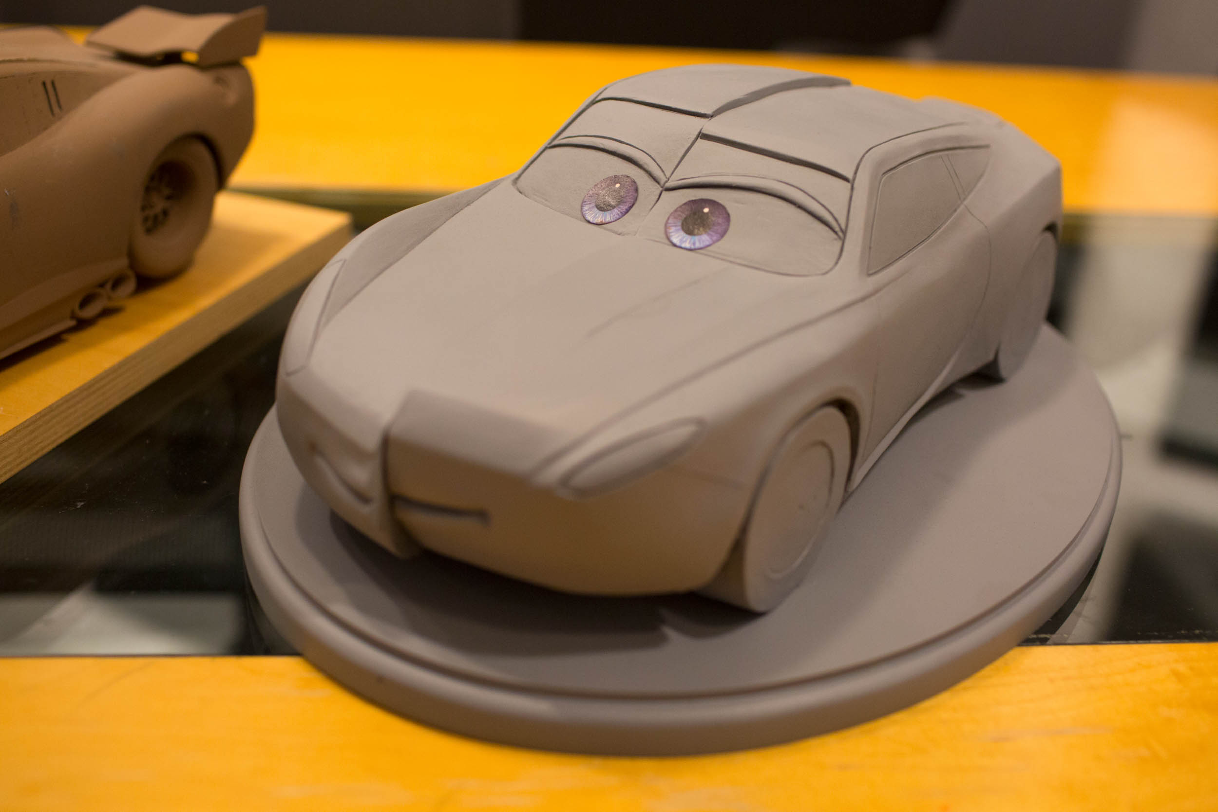
When the sketch process and the basic form of a car have stabilized, it’s time to call in the sculptor to create a bridge between the “Cars” universe and our own by sculpting a physical, clay model of the character. Why carve the clay? Because sketches and drawings alone don’t allow the filmmakers to fully understand how the car will look from various angles. For example, how low can the “camera” (the audience point of view) go before you lose the character’s eyes? This modeling step is critical toward optimizing the form of a key character. But if you’re a walk-on (if you’re an also-ran among dozens near the back of the grid at the Piston Cup 500) don’t expect any clay of your own.
The clay model is scanned and photographed and then overlays are drawn. These are hand sketches drawn over the top of the photos. These continue to be tweaked until finalized drawings firm up. Those finalized drawings are then passed along to a team who builds digital versions which, in turn, are used for the creation of a digital sculpture. Got all that? Excellent!
That digital sculpture is then sent to the digital paint booth where digital paint is sprayed on. Kidding! But there is indeed a process called digital painting. Think of it as the step that gives a digital model the look of a solid object.
Next comes rigging, which sets the character up for animation, and body callisthenic testing to ensure that when the animators do their work, everything about the character will move and behave as it should. These steps are crucial to assuring the animated character sticks to John Lasseter’s truth-to-materials mantra. When you see “Cars 3”, pay particular attention to the way characters move. When a character reaches out with a front tire, you can feel the tension of the suspension limiting that reach. That’s authenticity. That’s truth-to-materials. And that’s a job well done.
OK Brian, I get it. There’s a lot of work that goes into designing a “Cars” car. But what about “Cars 3” specifically?
“Cars 3” catches up with Lightning McQueen, that confident (cocky maybe?) racing newbie of the original “Cars” film. As Director Brian Fee explained, “We wanted to get back to continuing to tell McQueen’s story. The second film was more about Mater, so this time it felt right to return to the tone and realism of the first movie.” To which Co-Producer Andrea Warren adds, “We were thinking, where’s McQueen at? And what is his life like now that he has this Radiator Springs family but he doesn’t have Doc to anchor him?” This time around, many years have passed so McQueen has aged, times have changed, and there’s a new breed of racers to contend with. The “Cars 3” design team carefully considered who that new breed should be. Should they look like the current NASCAR racecars of our world? What, you mean generic, non-descript, and ugly? Umm…maybe not.
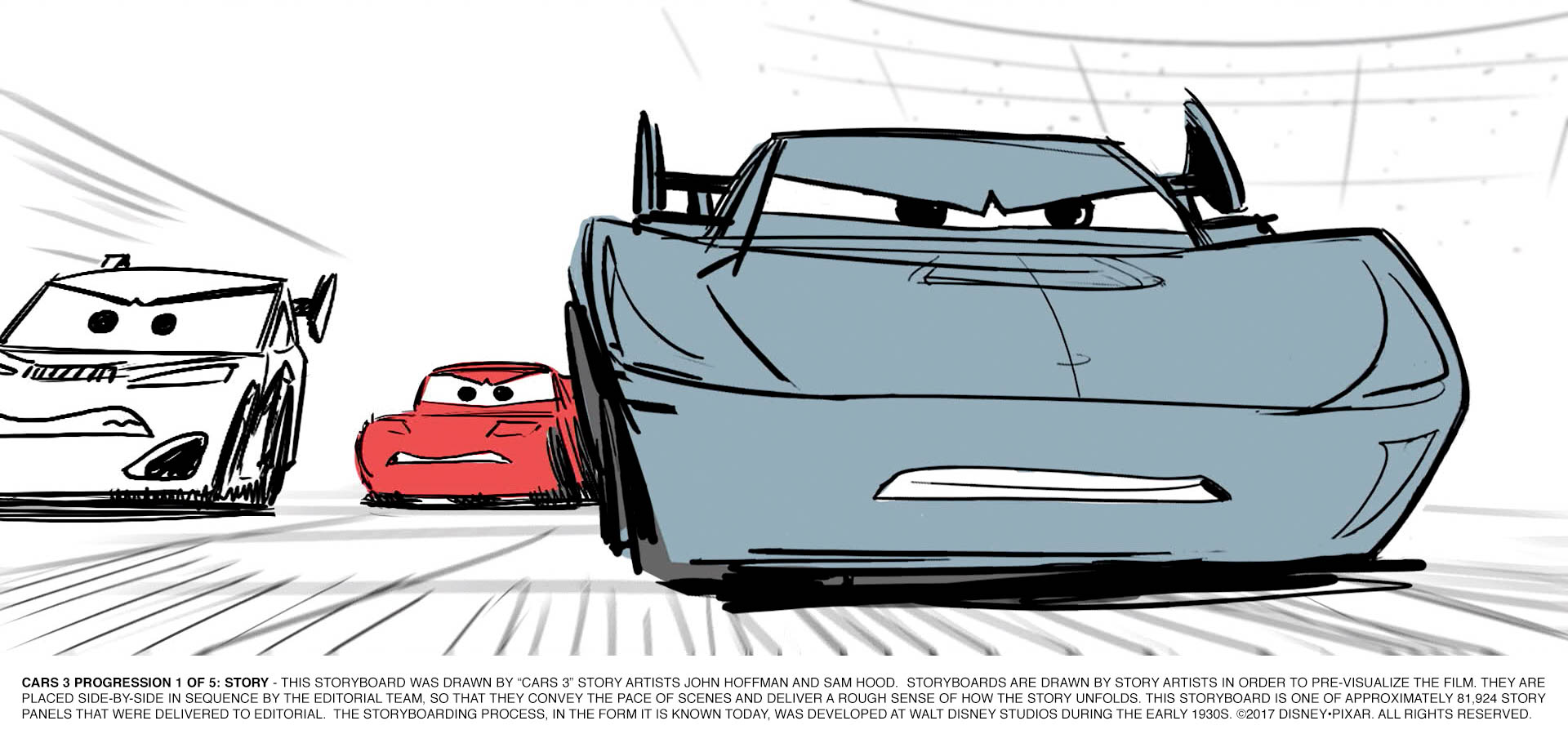
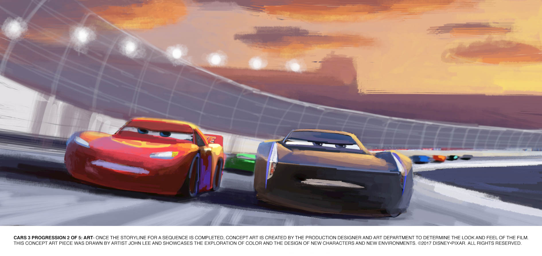
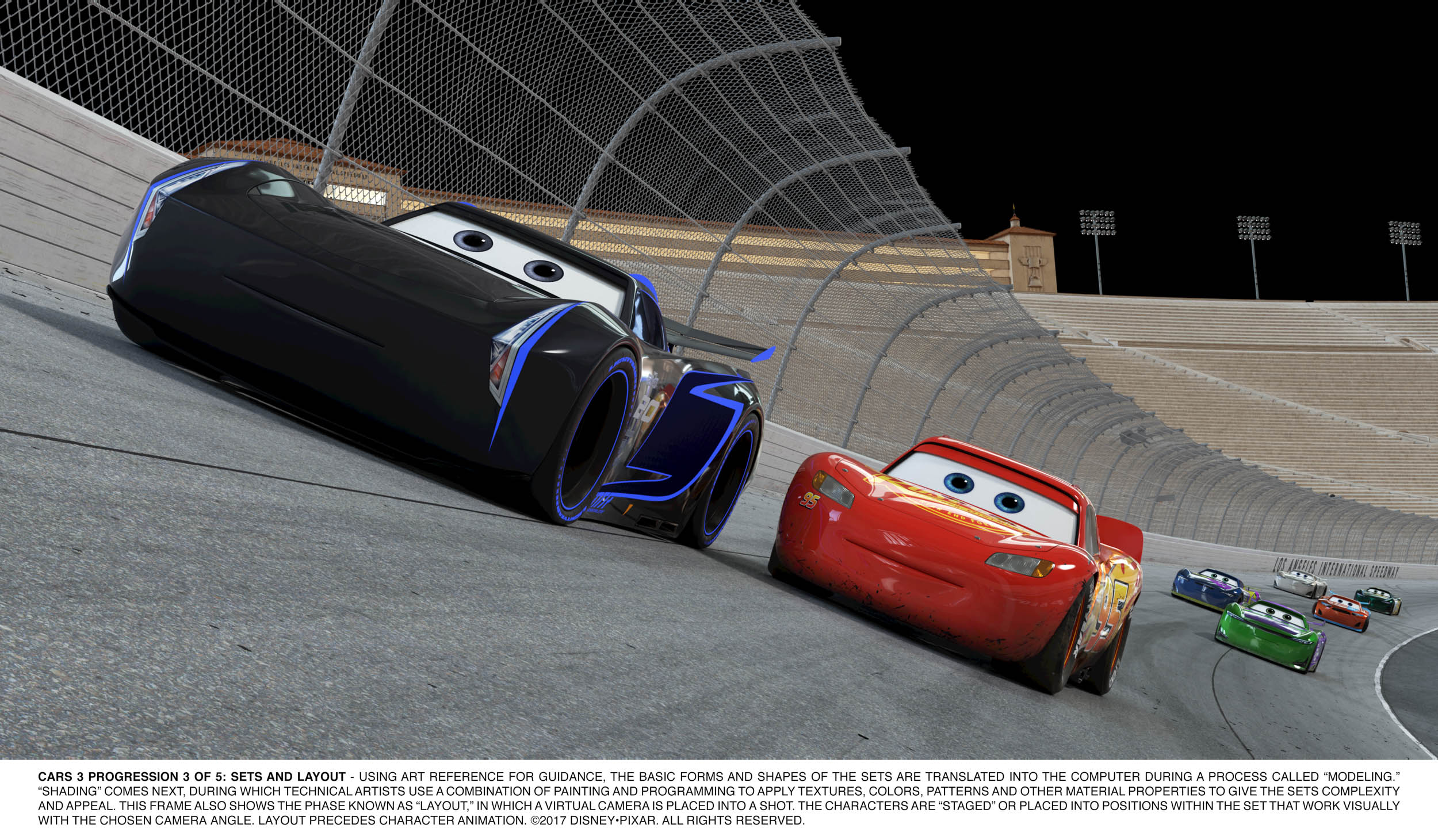
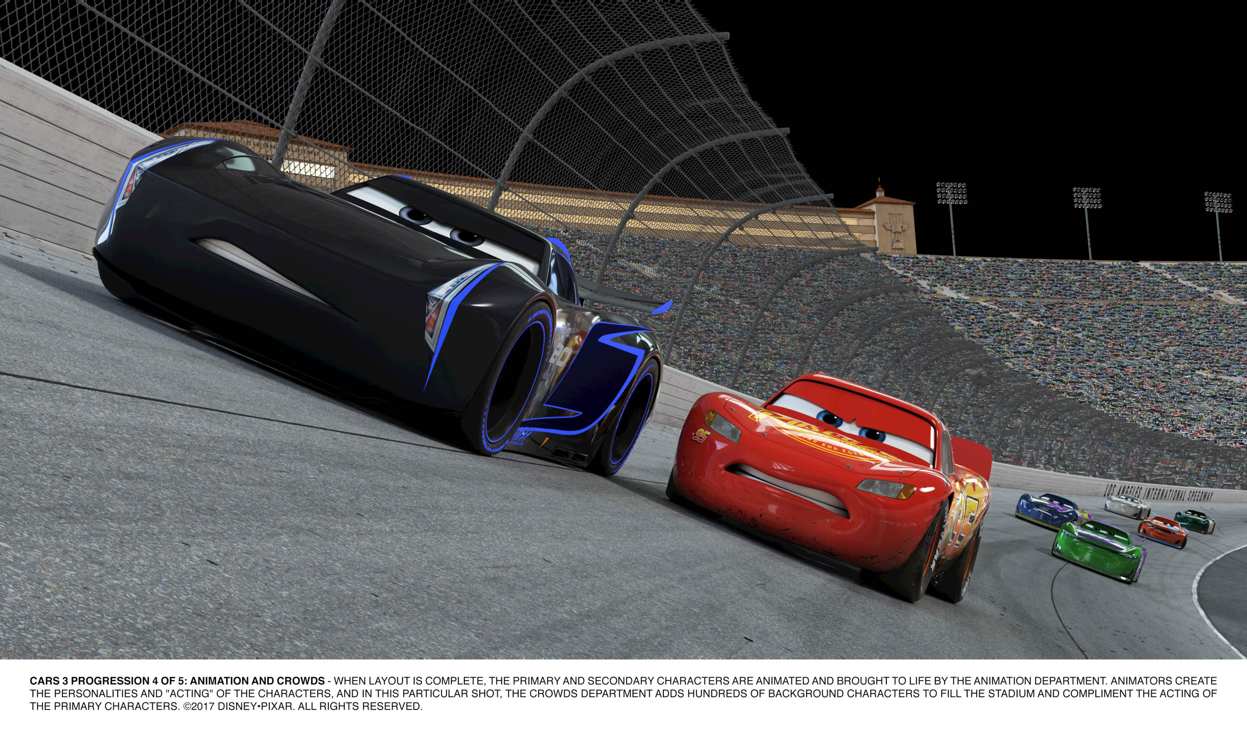
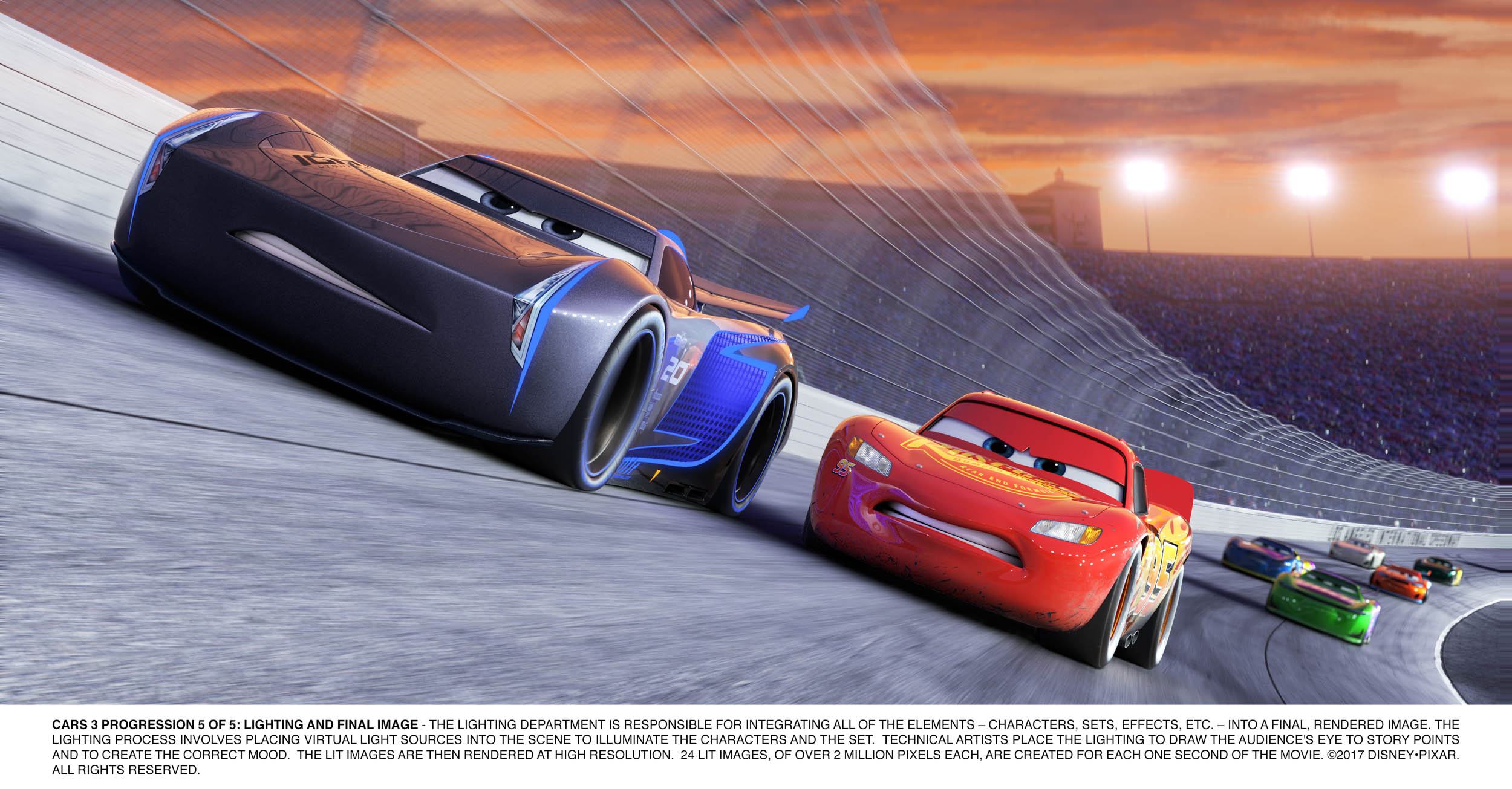
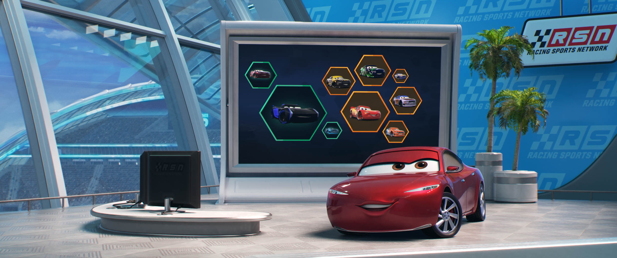
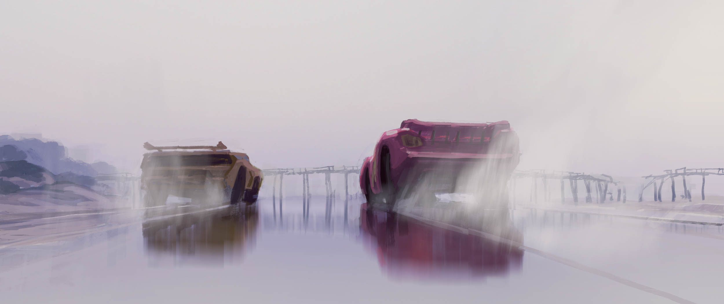
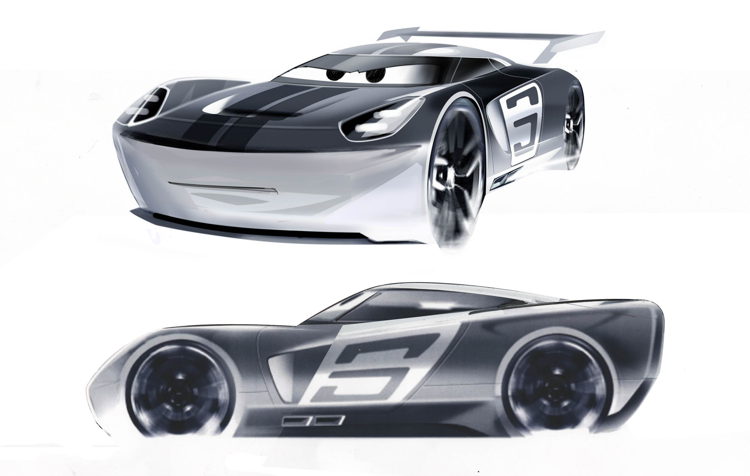
The team decided Lightning’s new rivals should contrast dramatically next to him. And that contrast should scream Next Generation. What might a “stock car” (racecar) look like 20 years from now? Big, bold, muscular, but edgy-modern. And since racing happens in the film, each key character must be instantly recognizable even when flying by at speed.
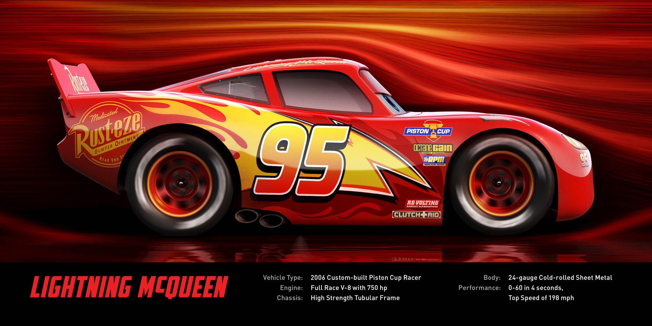
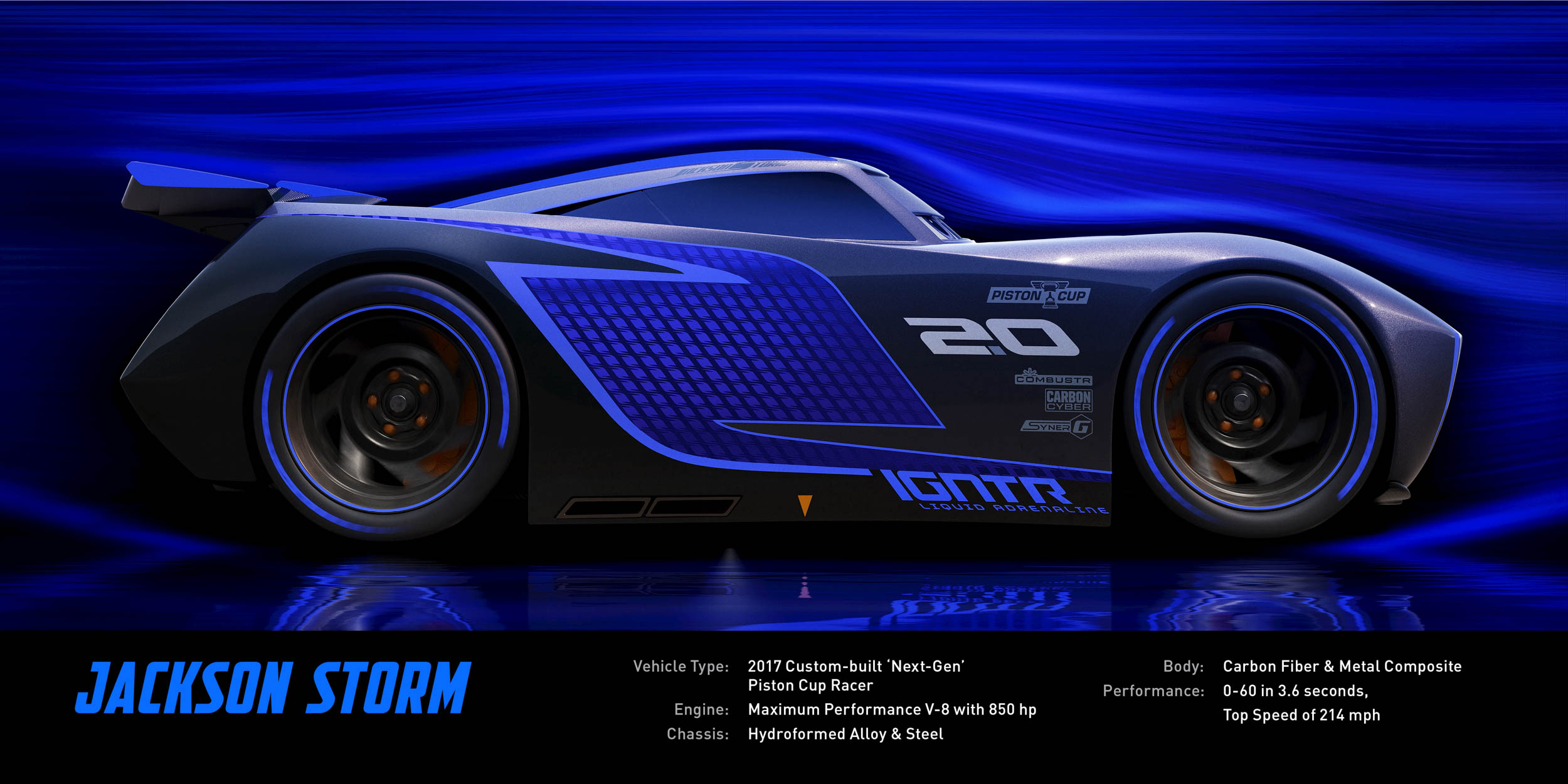
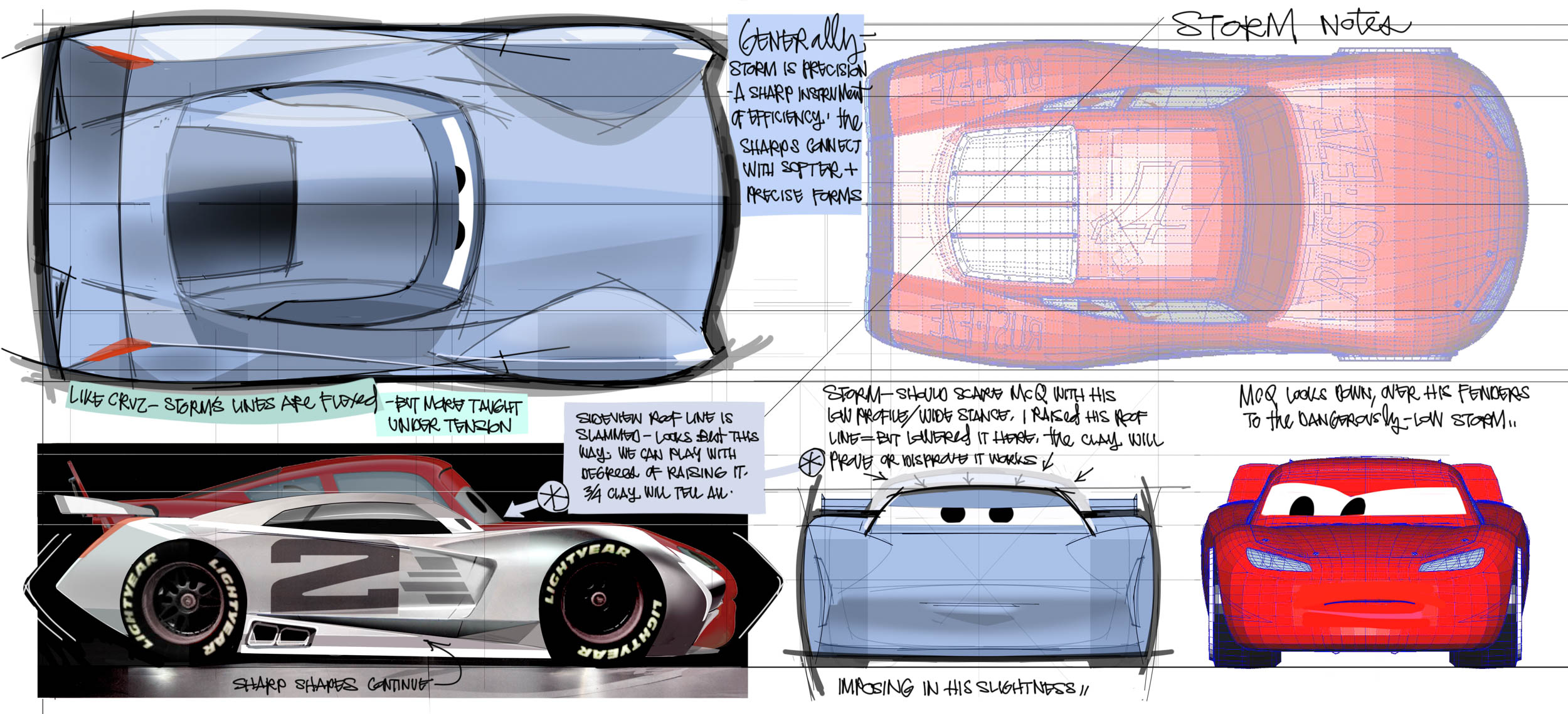
Lightning McQueen is a round expression of aerodynamics. There’s not an edge or a straight line on the guy, just curve meeting curve from end to end. I’m told “many” bold new real world cars were scrutinized before the first Jackson Storm line was laid on sketch paper. My eye picks up Cadillac influence at the front and bit of C7 Corvette at the rear. Your eye may disagree, but no matter, Jackson’s edges, creases, and taut surfaces stand him apart from McQueen. Storm is fresh and now. McQueen is almost vintage.
Passing a design through a filter of expert opinion is a worthwhile step. And when experts are needed, the “Cars 3” team is well connected. Ray Evernham (NASCAR analyst, former crew chief, and all-round motorsports guy), and others in his circle, provided feedback on the general look and attitude of the proposed next gen racers. And J Mays was generous to come in and help work the specific design of Jackson Storm.
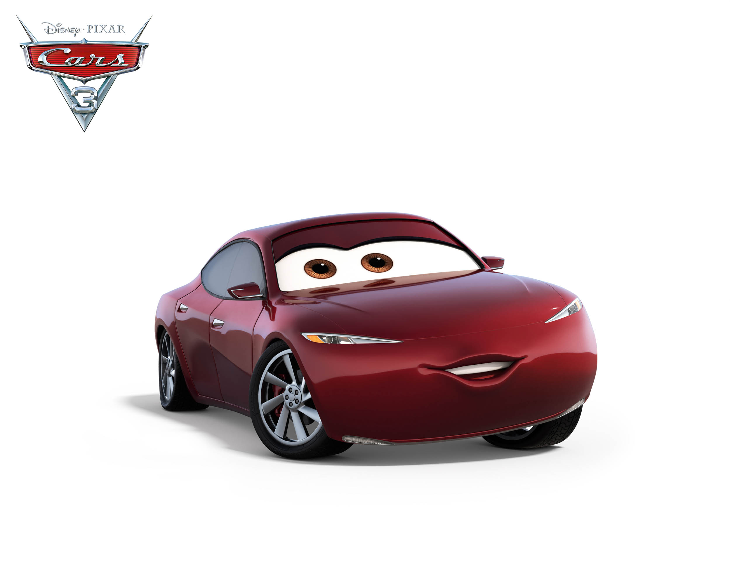
Other fresh designs were created for other new characters as well. Cruz Ramirez, for example. Cruz needed a design that combined American muscle with European sports car elegance. She posed a unique challenge as she’s not a racecar but is able to perform like one. She needed to exist on a performance level between McQueen and Storm.
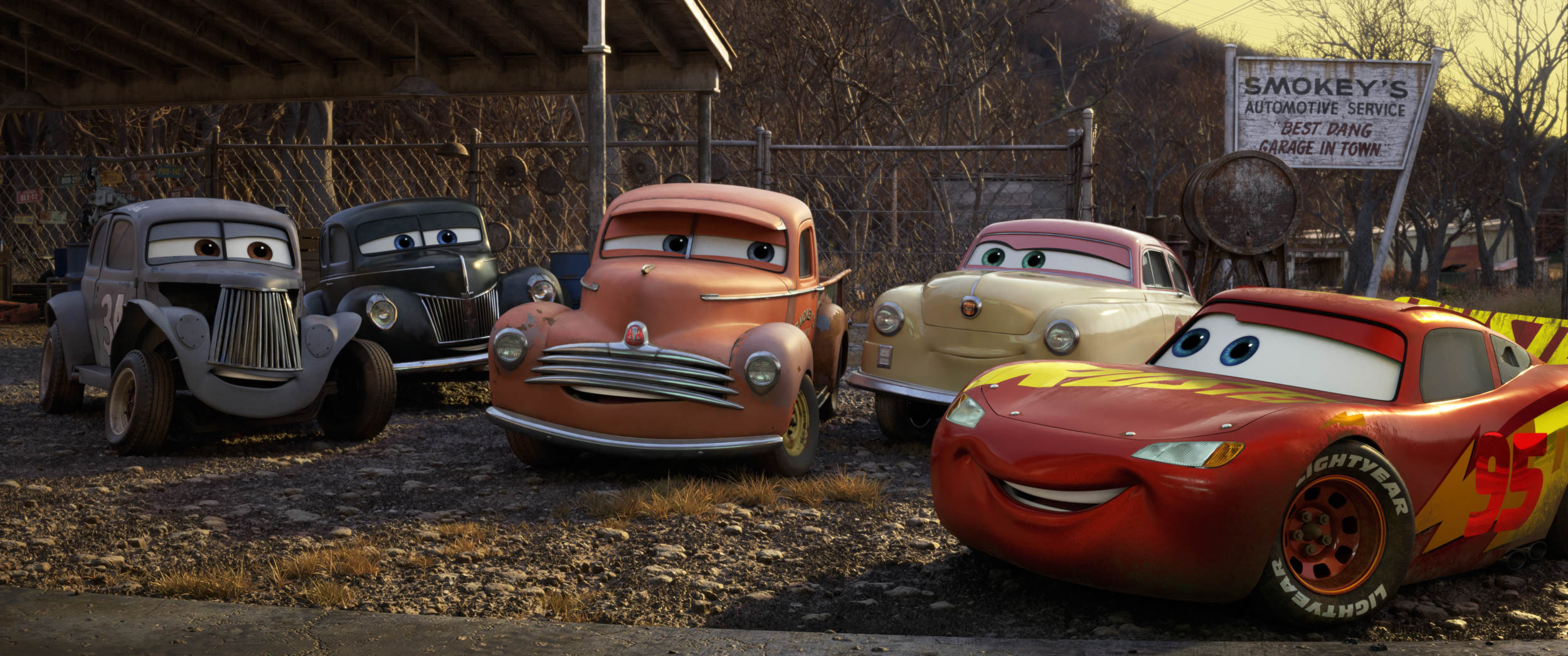
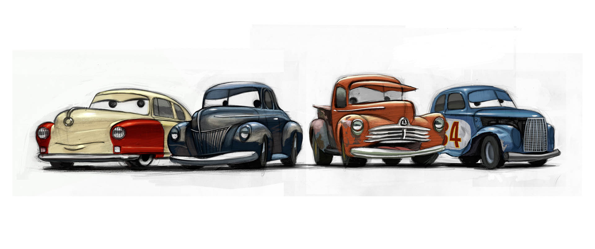
Then there are the new “legend characters”. Since Doc Hudson is gone now, four characters were woven into “Cars 3” to provide the desired link to the early days of stock car racing. Jay Ward, Creative Director (and automotive tech consultant extraordinaire) explained, “We know that Doc Hudson raced in ’51, ’52, ’53 and he had a big wreck in ’54. He left the racing world behind and never went back. For “Cars 3” we asked ourselves, ‘Who did Doc run with back in the day?’” All four legends are based on real people who were significant to early NASCAR.
First, Junior Johnson, ex-moonshiner and the first racer to bring major sponsorship to the sport, becomes Junior Moon in the film. At 80+ years of age he’s still scrappy and even voiced his own part in the film! Junior’s design is based on a ‘40 Ford ex-moonshine car that the team researched at Ray Evernham’s shop. Brian Fee took it for a drive, his 1st time working a 3-on-the-tree, and that sealed it!
Wendell Scott, a daring African American that raced NASCAR in the South during the 1950’s, becomes River Scott. His design is based on one of Wendell’s early dirt track cars. Notice his license plate: “MECHANIC ME”, a nod to the fact that Wendell was always his own mechanic.
Louise Smith, aka the First Lady of NASCAR, aka Louise “Barnstormer” Nash, won 38 races despite being unwelcome in a male dominated sport. She was tough and took no crap from any of the men. She was sponsored by Nash as her character design clearly shows. (Pssst, rumor has it Louise and Doc may have had a thing going for a bit back in the day…not confirmed.)
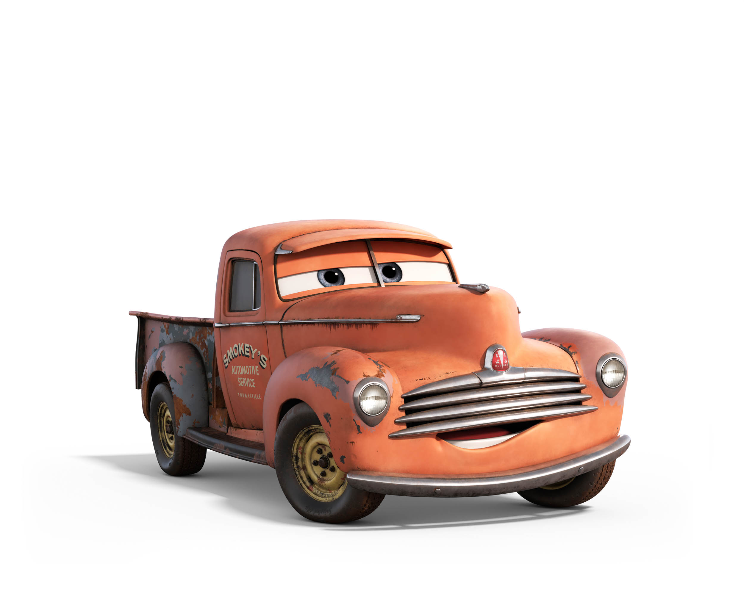
And finally, Smokey Yunick was not a driver but a heckuva mechanic. Smokey was a character who stretched the rule book until the binding nearly ripped. The first team Yunick was crew chief for was the legendary Hudson team. So, for “Cars 3” the character, simply called Smokey, is Doc’s ex-crew-chief. What better design for him than a ‘47 Hudson pickup truck with spectacular patina.
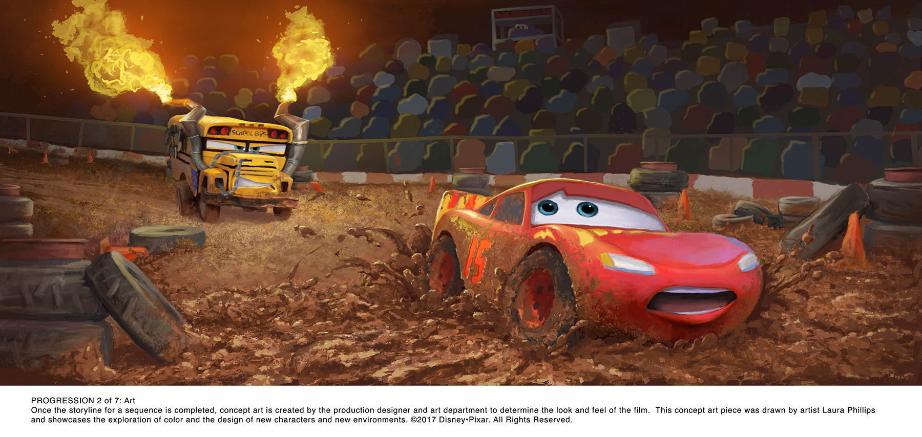
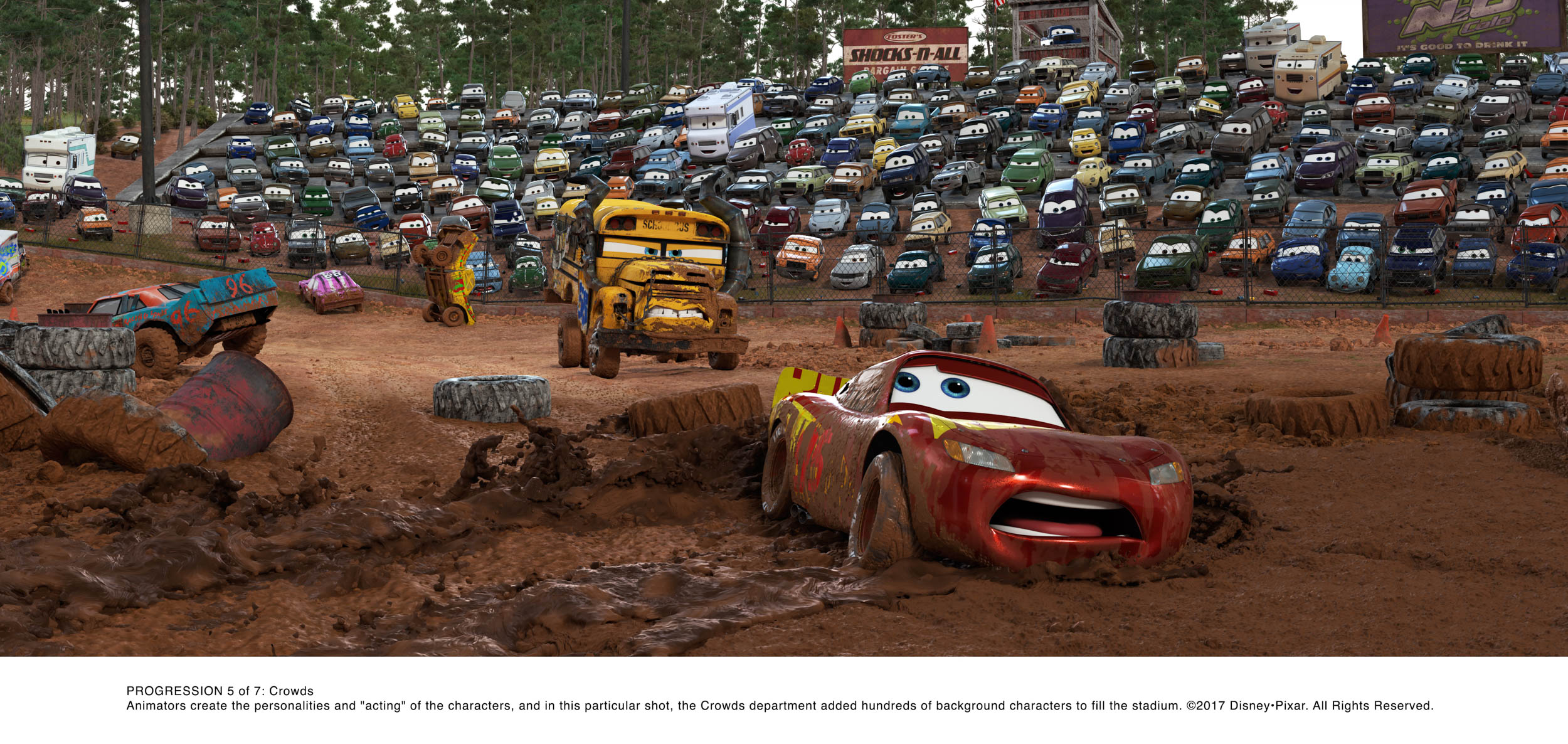
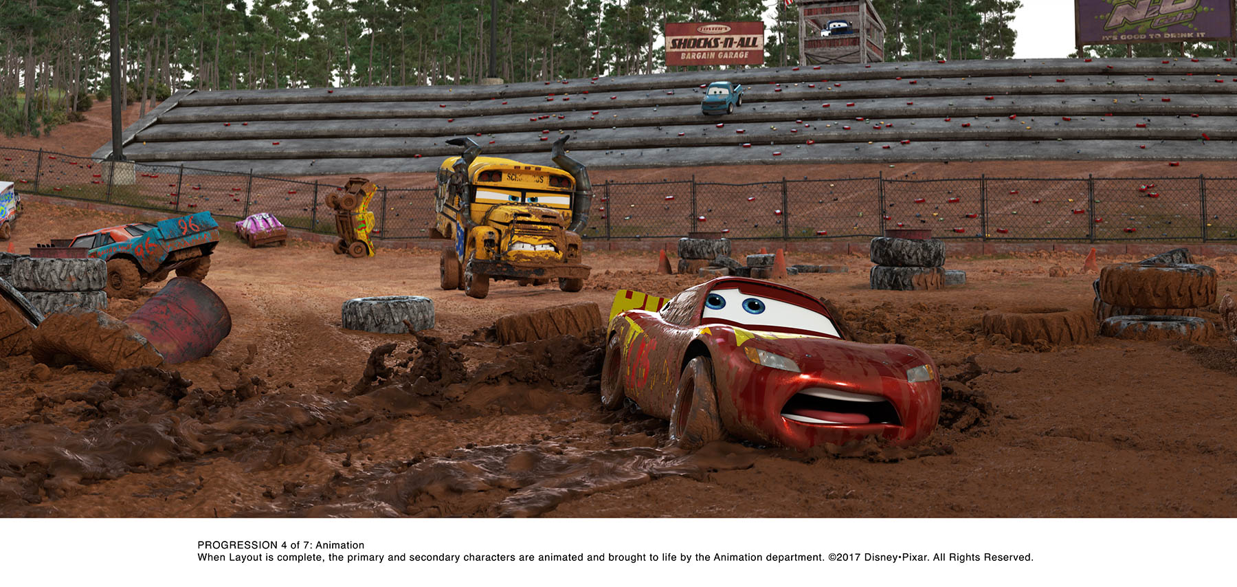
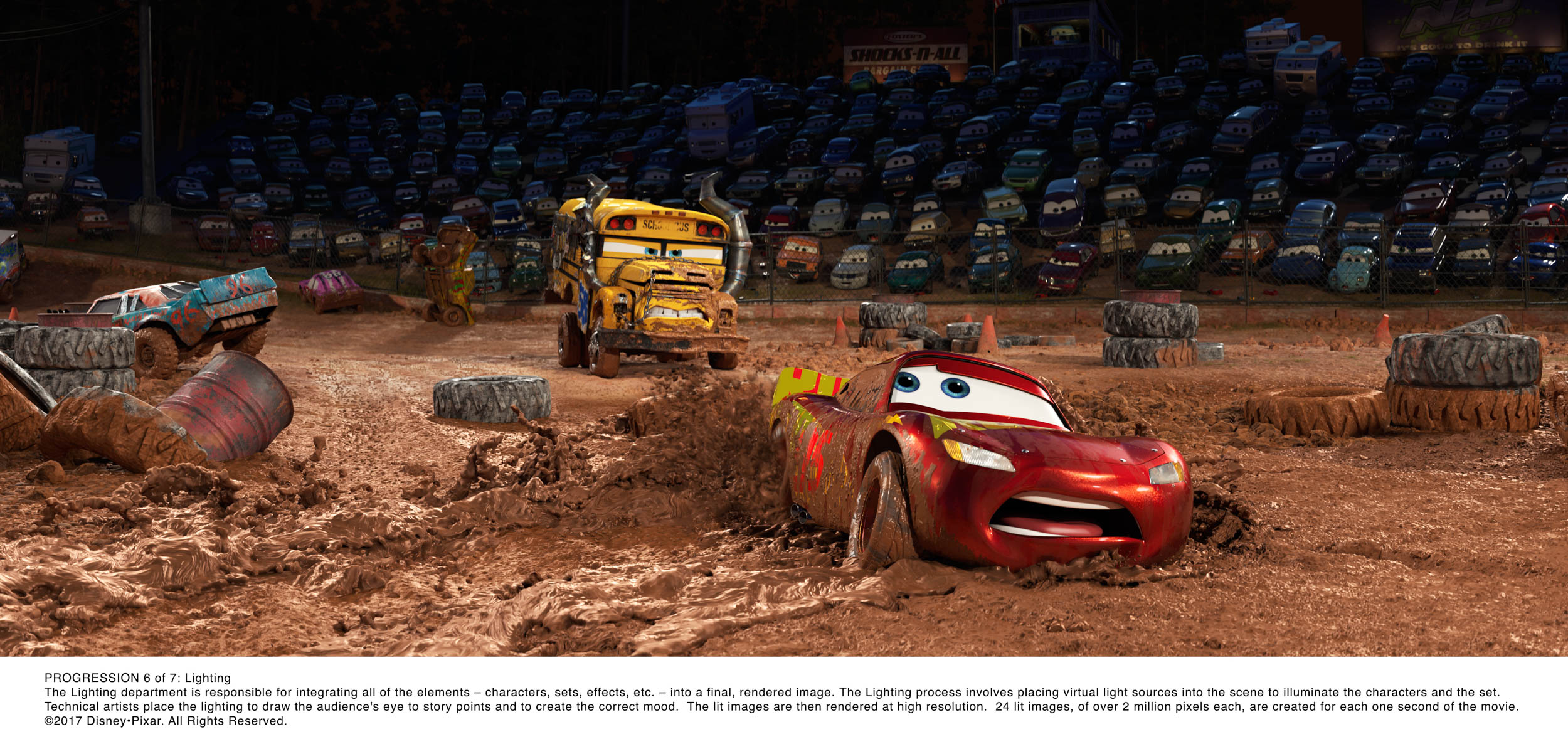
I was treated to a viewing of roughly 40% of Cars 3 at Pixar’s in-house theater…twenty-three days before it was set to open. And I viewed it from John Lasseter’s choice seat! SPOILER ALERT! “Cars 3” is fantastic entertainment. Despite being awe struck at the detail and realism of the previous “Cars” films, I immediately noticed we have entered a new era in animation authenticity. In a word…wow.
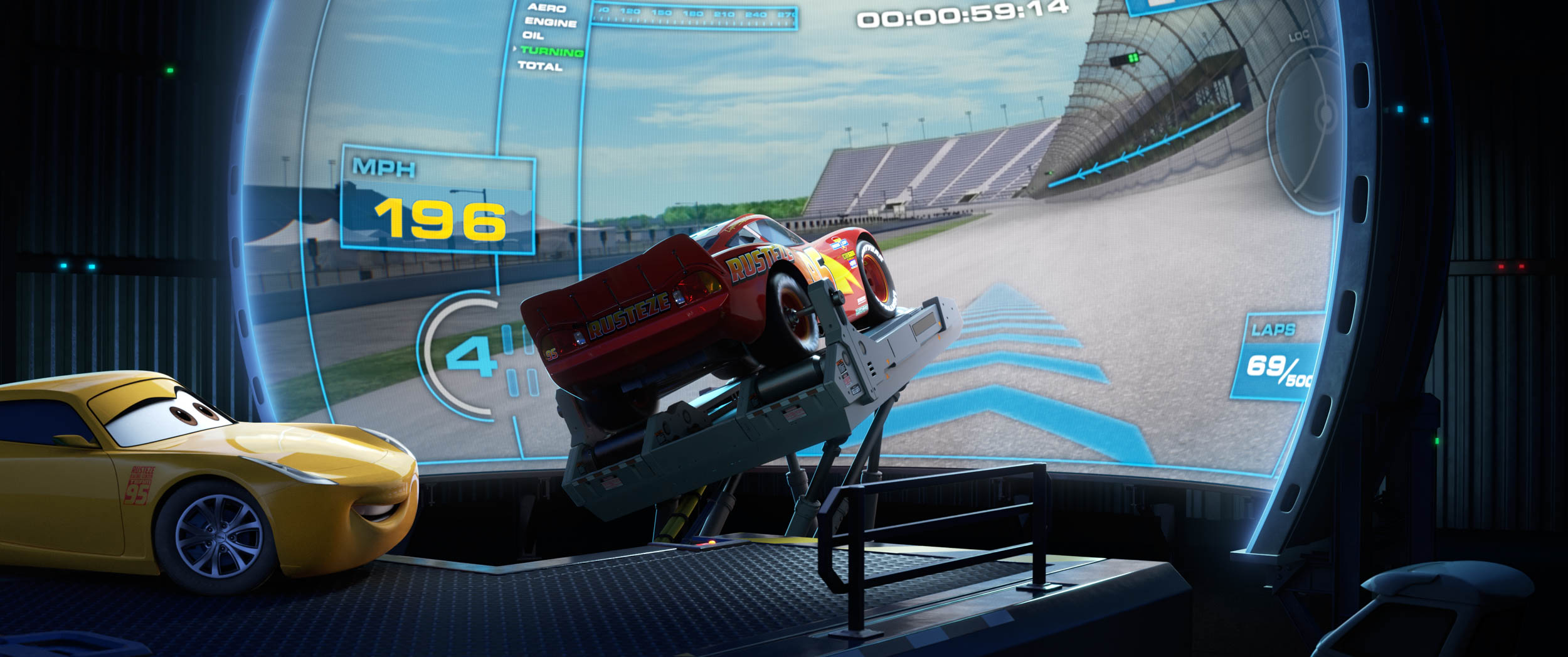
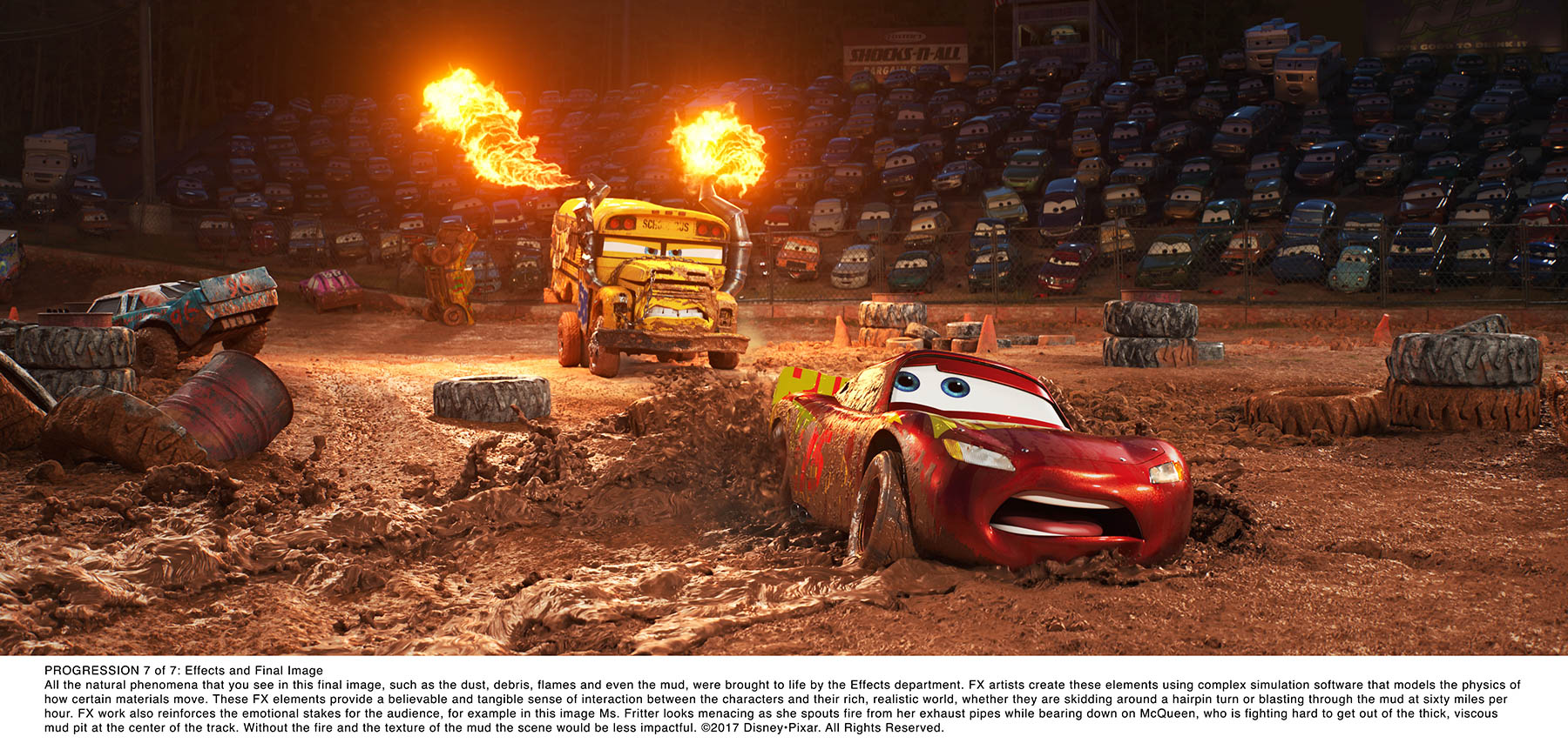
Rendering technologies are called upon to help designers build digital images that look incredibly life-like, and those technologies have advanced a whole bunch since the days when Lightning McQueen first emerged from the sketchpad. Shading, reflections, light and shadows are all more authentic now. Characters Supervisor Michael Comet demonstrated just a few leaps made recently. Tires can now bulge and puff as a character car weights and unweights, and the degree of puff is adjustable. Painted surfaces on the cars can now reflect light in a complex way, like modern layered paints. In fact the digital “paint” can be laid on the car in layers (think color coat, and then clear coat) and the reflectivity or shininess of each coat is controlled independently. Then those painted surfaces can be “imperfected” by adding micro swirls, you know, those barely visible scratches you put on your car when you wash it. (Ask me why I never buy black cars.) And those headlights! Oh my. The headlights on a “Cars 3” car are built up of at least 3 components, bulb, reflector, and lens, so the light they emit closely emulates real world lighting.
Materials Artists design the colors, textures, and patterns that will be applied to various surfaces of the characters. Will Smokey need some surface rust or other vintage patina? No problem. Might Jackson Storm be sporting carbon fiber? They’ve got it covered (so to speak). Then there are graphics.
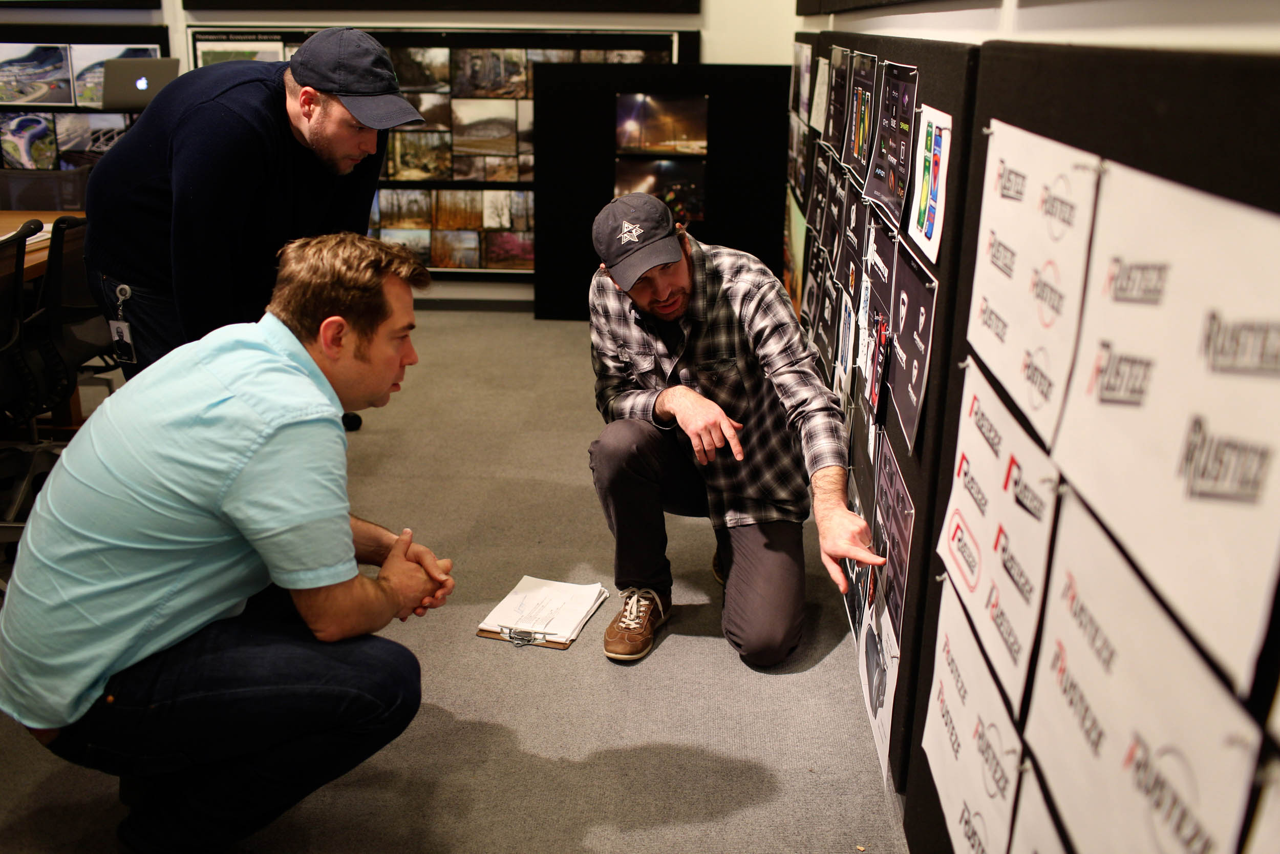
Racecars gotta wear graphics. I get that. Sponsors = graphics. But take a look at a NASCAR car of today and you won’t see the car at all. Instead, it is cleverly hidden within a rolling psychotic nightmare of names and logos. The next gen racers of “Cars 3”, on the other hand, are rather handsome. And since Lightning McQueen has always worn a signature lightning bolt, Mr. Storm was given his own icon…a stylized “S” based on the international hurricane symbol. Cool.
They spend that much time and effort on a cartoon headlight? Really? Yes, and that ain’t nothin’! The level of detail designed into these character cars is…I don’t know… obsessive? Ridiculous? Crazy? Maybe so, but it’s also unique, special, and wonderful. When a “Cars” car jumps, or rolls, you catch a quick glimpse of the underside. Is it just a neutral gray surface? Hardly. Freeze and you’ll find a car frame, exhaust system, control arms, springs, shocks and more! OK, let’s hit the pause button for a moment.
Going into this magical day at Pixar, I had made up my mind. If I could ask only one question it would be, “why?” Why invest so much time, so much talent, so much money toward getting every microscopic detail correct? Over the course of the day I asked it several times. Everyone…Brian Fee, Bill Cone, Jay Ward to name a few…offered their version of the same theme. There are two reasons. First is the culture at Pixar of pride and simply doing your absolute best. Secondly, while a viewer might not notice any one detail, if that level of detail were generally dialed back, the viewer might notice a vague “wrongness” about the world they’re seeing. Conspicuous absence, I suppose. And worst of all, if someone were to notice a detail that’s not authentic, they’d soon notice another, and another and then they’d disengage from the story. OK, back on task…
Once the character has been fleshed out visually, the work of rigging and articulation can begin. This job of the Character Department fascinates the engineer in me. There are hundreds of controls just for facial movement alone. Left, right, center, up, down, forward, back, twist, eyes, lids, mouth, cheek puff and on and on. This is one area where tweaking occurs after the voice actor has signed on. When you watch a “Cars” film, if you think the car resembles the actor behind the voice, you’re not quite right. According to Directing Animator Jude Brownbill, physical attributes are seldom designed to resemble the actor. What you’re picking up on are mannerisms. During rigging, the mouth, eyes, and lids can be set up to shape and move appropriately to the actor’s style of speech. (Although in “Cars 3” one character does sport a heavy black windshield frame, based on the actor’s choice of eyewear. Watch it and see if you pick it up!)
Cruz Ramirez is an exception as the character was largely based on her voice actor, Cristela Alonzo. As Brownbill says, “Like Cristela, Cruz is smart, funny, and came from a modest beginning, seeking success in an unconventional field.” The team studied Cristela very carefully, watching many clips from her television appearances and standup routines. For her look they landed on a paisley shape for the mouth, brown eyes, and more arched lids.
By the way, it was “Susie the Little Blue Coupe”—a 1952 Disney short—that inspired John Lasseter for the first “Cars” to use the whole windshield area for the eyes. Doing so allows the face to occupy much of the car, rather than just the front end, which enables greater expressive range.
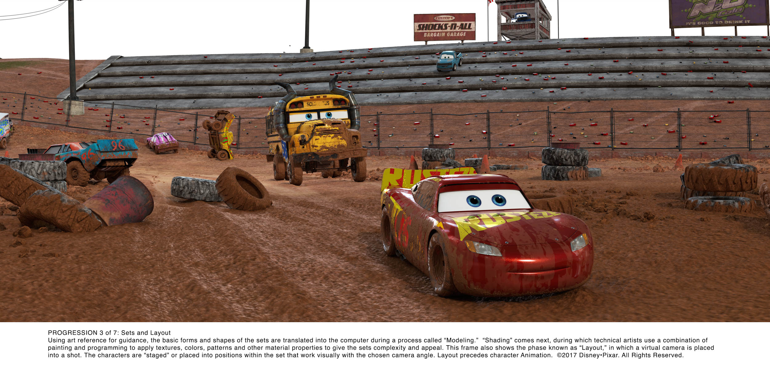
Beyond facial rigging, each character’s wheels, tires, and body are rigged to behave authentically. There’s that word again…authentic. John Lasseter insists on authenticity. Not accuracy, but authenticity. It’s closely wired to his truth-to-materials rule. Think of it this way…physics is alive and well in the “Cars” world. That means there is a suspension system under each car, controlling the way the car’s 2,000-5,000 lbs of mass moves. Less for Guido, more for Mac, but you get my drift. And drift they do, around that dirt track, in a way that’s authentic to their mass and the limited friction between rubber and dirt.
A goal of the rigging effort is to automate a character’s physical behaviors and responses as much as possible before handing that character off for animation. That allows the animators to focus on the acting.
One of the challenges during the animation of characters in a sequel like “Cars 3” is to maintain the personality and movement style of characters familiar from the previous films, while working with more advanced technology. The heightened level of visual realism meant that for “Cars 3” animators needed to dial back from the exaggerated, “cartoony” movements of earlier films. Truth-to-materials is now more important than ever. In the case of Lightning McQueen, while he’s a familiar central character his movements for “Cars 3” add a bit of age to the athlete. Now he’s not quite as agile. McQueen the legend is a tad stiffer than was the rookie. Meanwhile, new nemesis Jackson Storm moves with effortless precision.
Speaking of Jackson Storm’s moves, while listening to audio clips of Storm’s voice actor, Armie Hammer, the animators found that what worked best for him was over-articulated mouth movements. Why? Because Armie enunciates very clearly. Further, Jackson Storm’s body movements were purposely limited because often the most powerful, confident person in a room tends to move the least. Yup, even psychology comes into play when designing cars for a world where they’re alive.
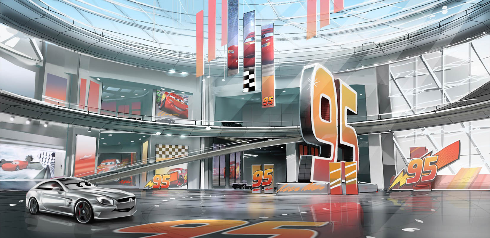
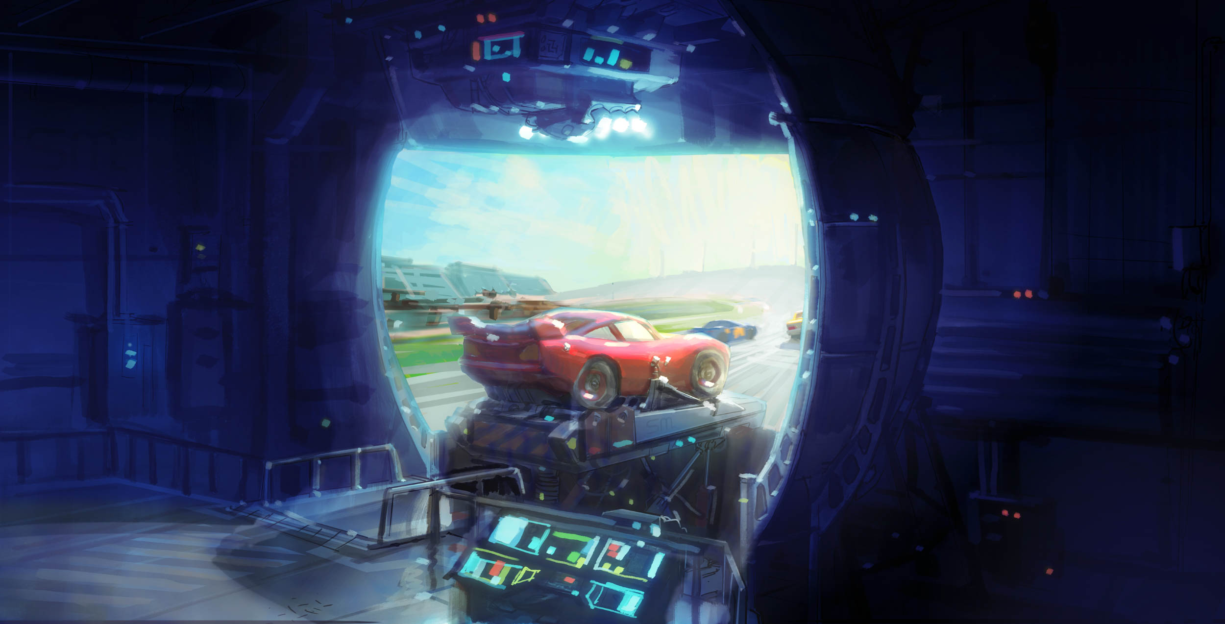
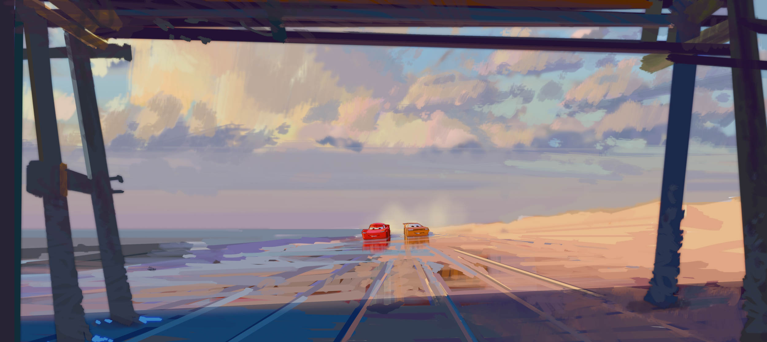
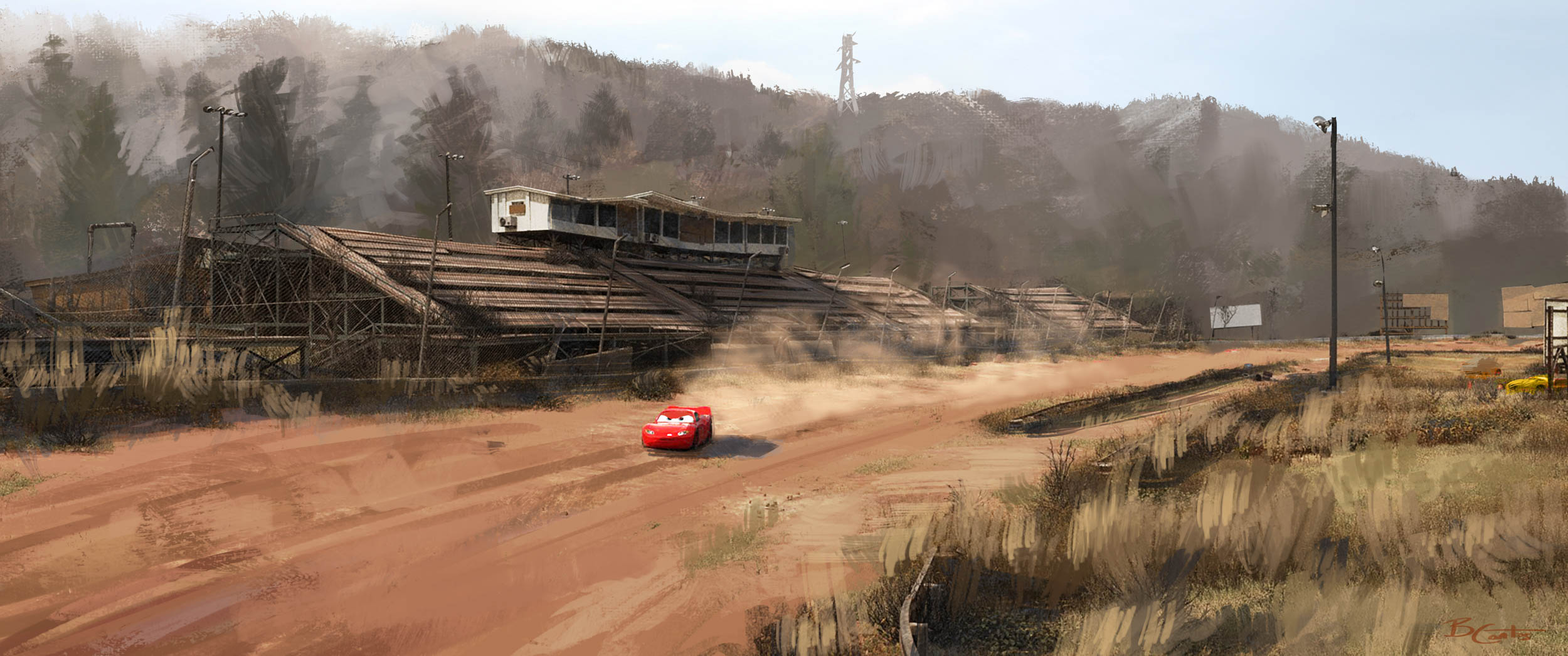
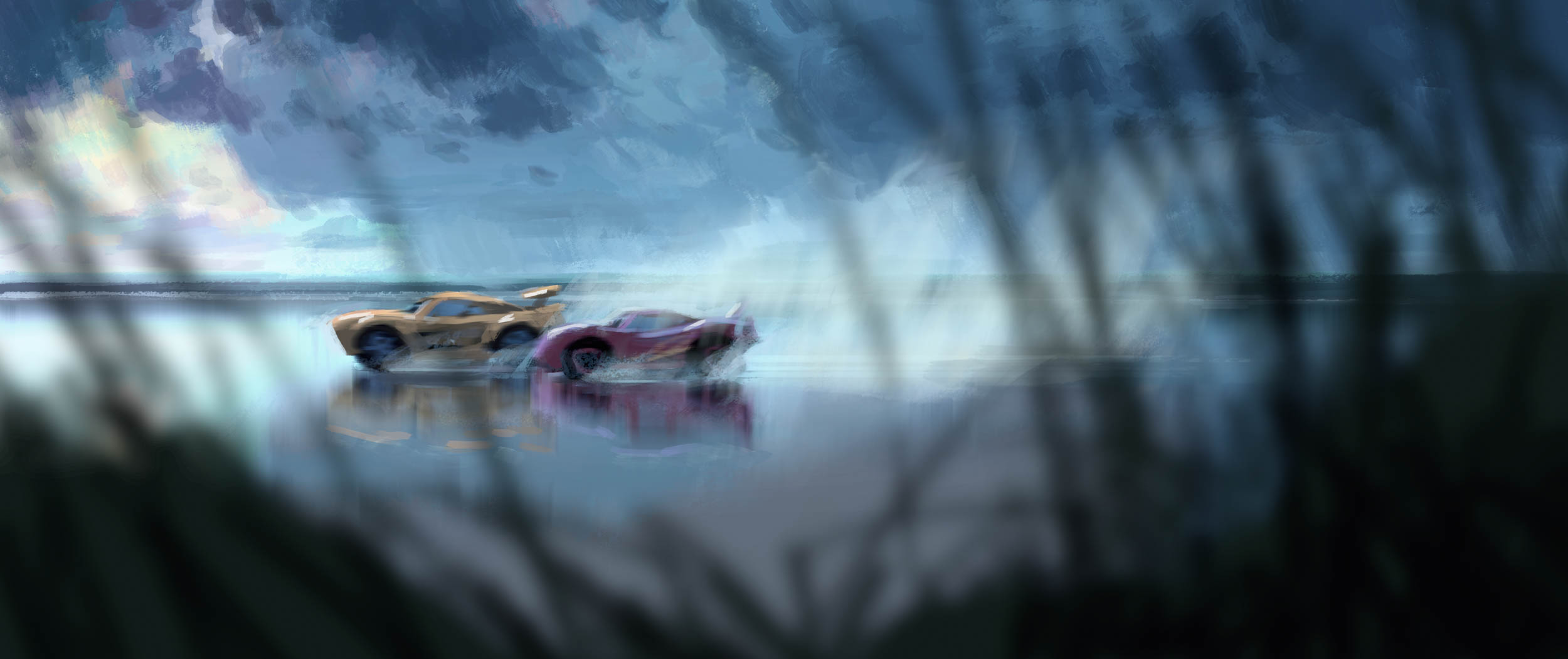
As you may have gathered, the Design process at the Pixar studio is exhaustive and as I reflect on the world created for “Cars 3” something occurs to me. This studio not only tackles designs of vehicles both new and old, they also design the very world in which the vehicles exist. From speedway to dirt track, city to countryside, garage to diner. Vehicles yes, but also architecture, flora, land, water, even the skies. And the attention to authenticity that goes into every car design goes equally into every aspect of designing the “Cars” world itself. Set designers Han Cho and Bill Cone described intensive research involving a lot of travel, photography, and eyes-wide-open attention to surroundings. They searched for and found just the right locations. They studied the paintings of regional artists to understand how they depict their locales to nail just the right “feel”. They had to consider how a café table would be designed if patrons were automobiles instead of humans. The team agonized over exactly how the angle of the sun or moon—at that exact time of year, at that exact location—alters the colors of a landscape, and whether or not a rhododendron would be green at that time and place. Designers at Ford, Pagani or any other auto manufacturer don’t need to consider or care about any of that. They just design cars for an existing world. Meanwhile their counterparts at Pixar are working tirelessly on the texture of barn boards, the proper shapes of cloud formations, the fuzzy nature of neon light, and the way a passing car ripples the surface of a puddle. But that’s a worthy story all its own, for another writer, at another magazine. So for now, go see “Cars 3” and be amazed!
Originally published in 2017.
